iOS System Design of an E-Commerce App
(Etsy Example)
In this article I’ll walk you through a hypothetical system architecture design of an e-commerce app, using Etsy as an example. This design could be useful in your system design interview, or in general if you’re attempting to build an iOS e-commerce app.
Since in your system design interview you won’t have enough time to design the entire application, I’ll focus only on two sets of features you’re likely to be asked to focus on for an e-commerce app — Home screen/feed of products and Product Details screen.
NOTE: This is not a perfect production-ready solution, this is a big picture overview of a potential architecture you could use. It omits a lot of details that could only be discussed and understood in a context of a real production codebase. Nevertheless this should give you a good jump start approaching your iOS system design interview or beginning phases of building a real app.
This article is an excerpt chapter from iOS System Design Interview Course that I'm working on. Check it out if you're looking to prepare for iOS system design interviews. It has chapters like this one and videos covering system design of various iOS apps such as: Social Media (Instagram), E-commerce (Etsy), Messenger (Facebook Messenger), and more.
ANOTHER NOTE: There are many assumptions made in this article, and it does not map one-to-one how the actual Etsy app works. I mention that whenever possible throughout the article but, overall, I tried to be consistent with the feature set of the Etsy app, as it's a good representation of an e-commerce application.
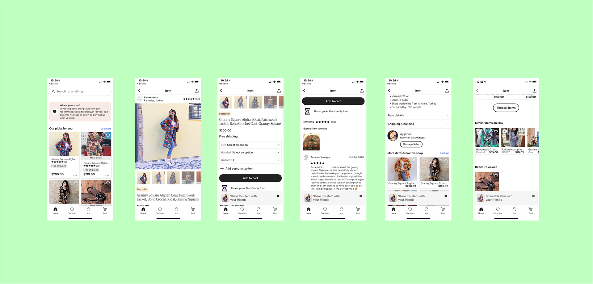
App Features Overview
Etsy app has a standard iOS tab-based navigation design with tabs for Home, Favorites, Updates, You, and Cart screens.
NOTE: Likely, in a complex app like Etsy, under the hood it’s not implemented using UITabBarController, but rather a custom container ViewController that has child view controllers using containment API.
Home Tab
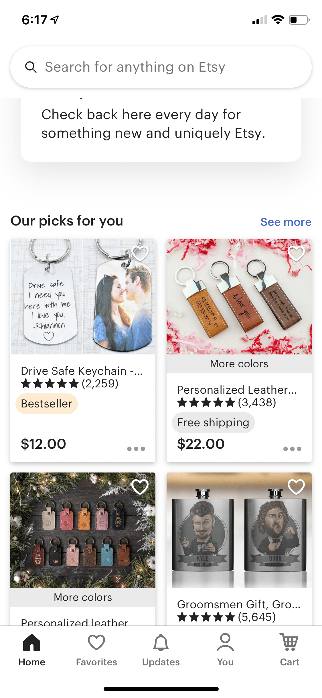
Home Tab displays the user’s main feed of product recommendations based on the user’s interests, tags, likes, etc. It also has a promo/hero section for some unique offerings (and likely for other new features, based on A/B testing) and other types of content like recommended stores, recently viewed items, etc.
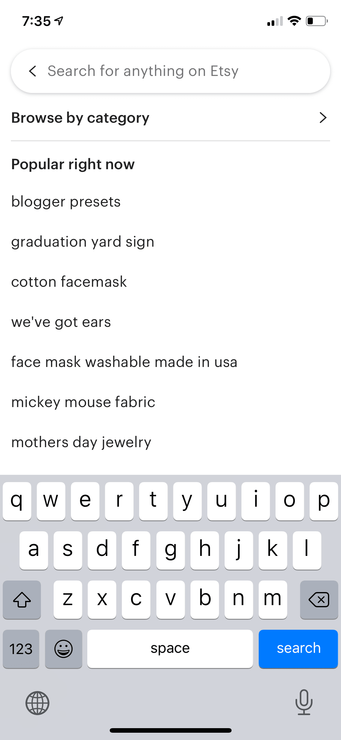
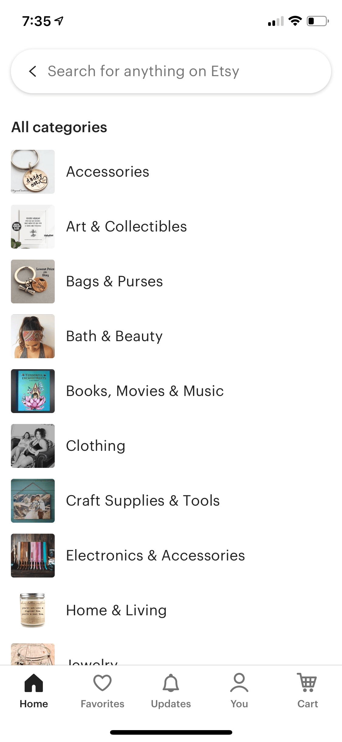
It also has a search bar at the top and upon selecting it, the user sees a list of searches and can tap on Browse by Category to see the list of categories of items on Etsy. Ultimately, the user can get to another products list screen that looks much the same as the initial list of items in the Home Tab.
This is one of the features that your interviewer most likely will want you to focus on and design in detail. We’ll go deeper into Home Tab implementation later in the article.


Favorites Tab
Favorites Tab consists of two tabs/pages that display the list of favorited items and list of favorited shops.
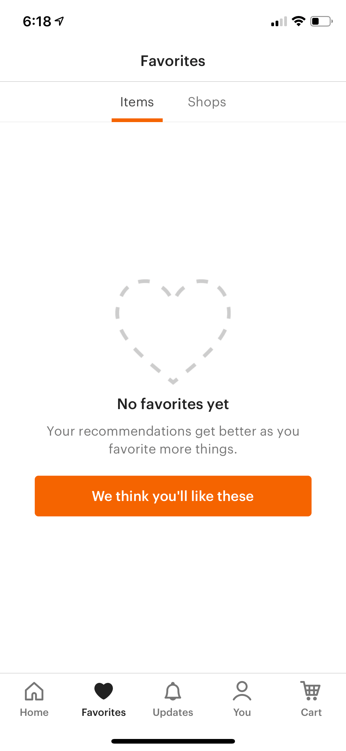
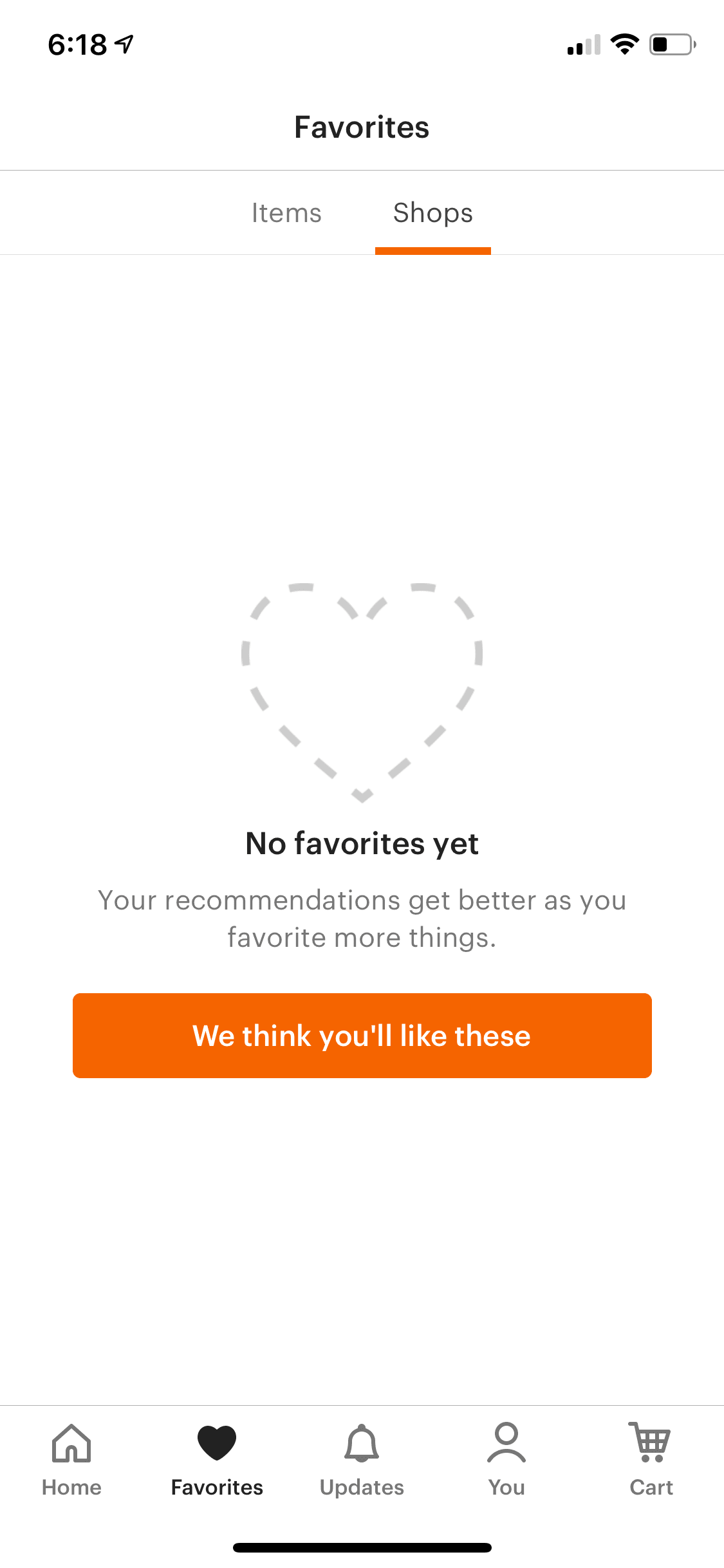
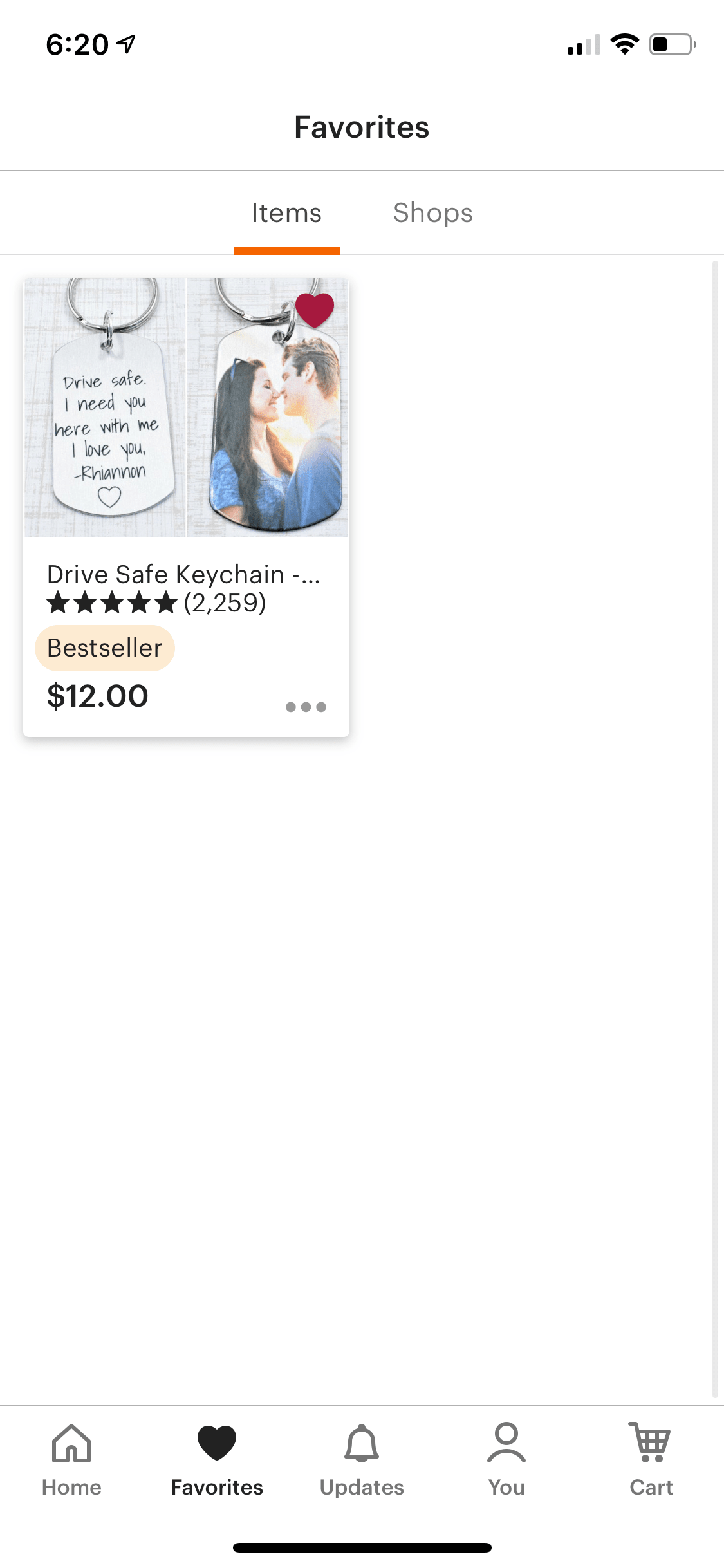
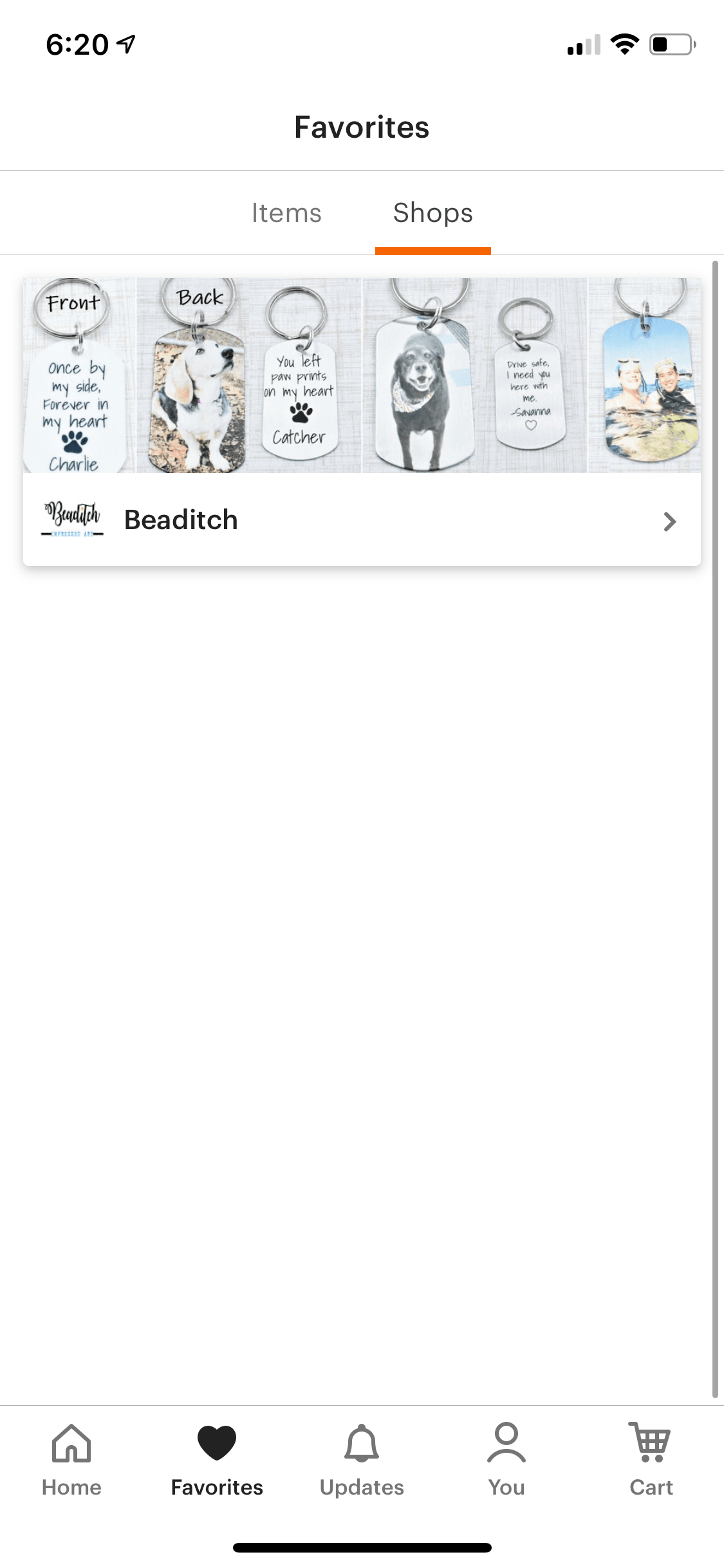
Note that after you tap the favor/heart/like button on an item or a store and switch to Favorites Tab, you don’t see either list update immediately; it will update only after you pull to refresh. This likely means that Etsy doesn’t use a local storage database such as Core Data or Realm or SQL and instead relies on ephemeral in-memory storage. Also, most likely there is no centralized source of truth that is shared across the app for individual views in the app to observe and refresh upon changes.
Updates Tab
This tab displays notifications about the user’s favorited items, orders, shops, etc. This tab was actually added as a new feature right after I started writing this article, so I will skip it.
But it is worth mentioning that this is an example of extendability and flexibility that your system design will need to support. It is likely that this new feature is rolled out to a certain percentage of all users, or an A/B testing group, rather than being shown to all users. In your design interview, you should address this and cover an A/B testing service of sorts that will be used throughout the app to determine what parts of the app are available for a particular user and change/adopt behavior accordingly. I’ll cover more about A/B testing services in a further section.
You Tab
You Tab displays a list of buttons to get to the user profile, messages, purchases & reviews, settings, and help screens.
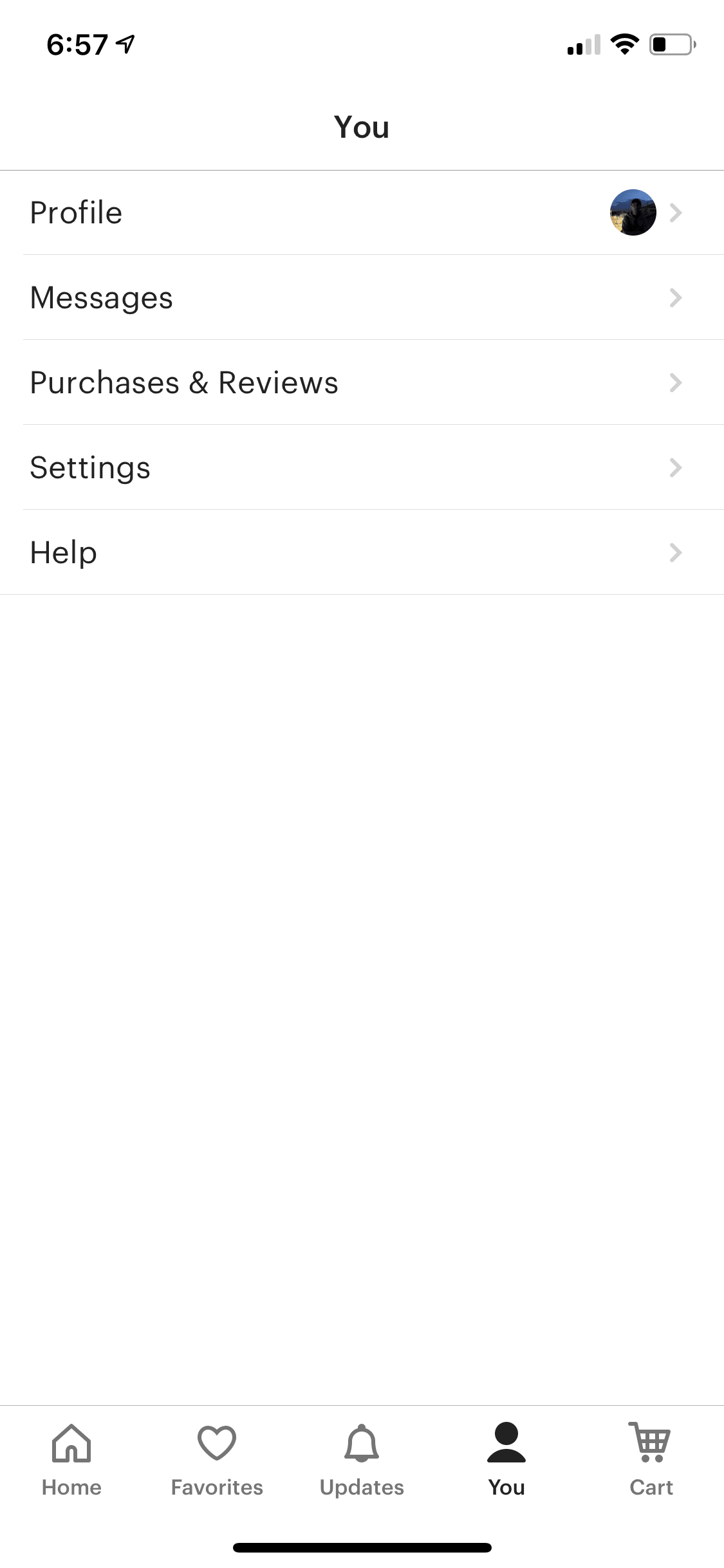
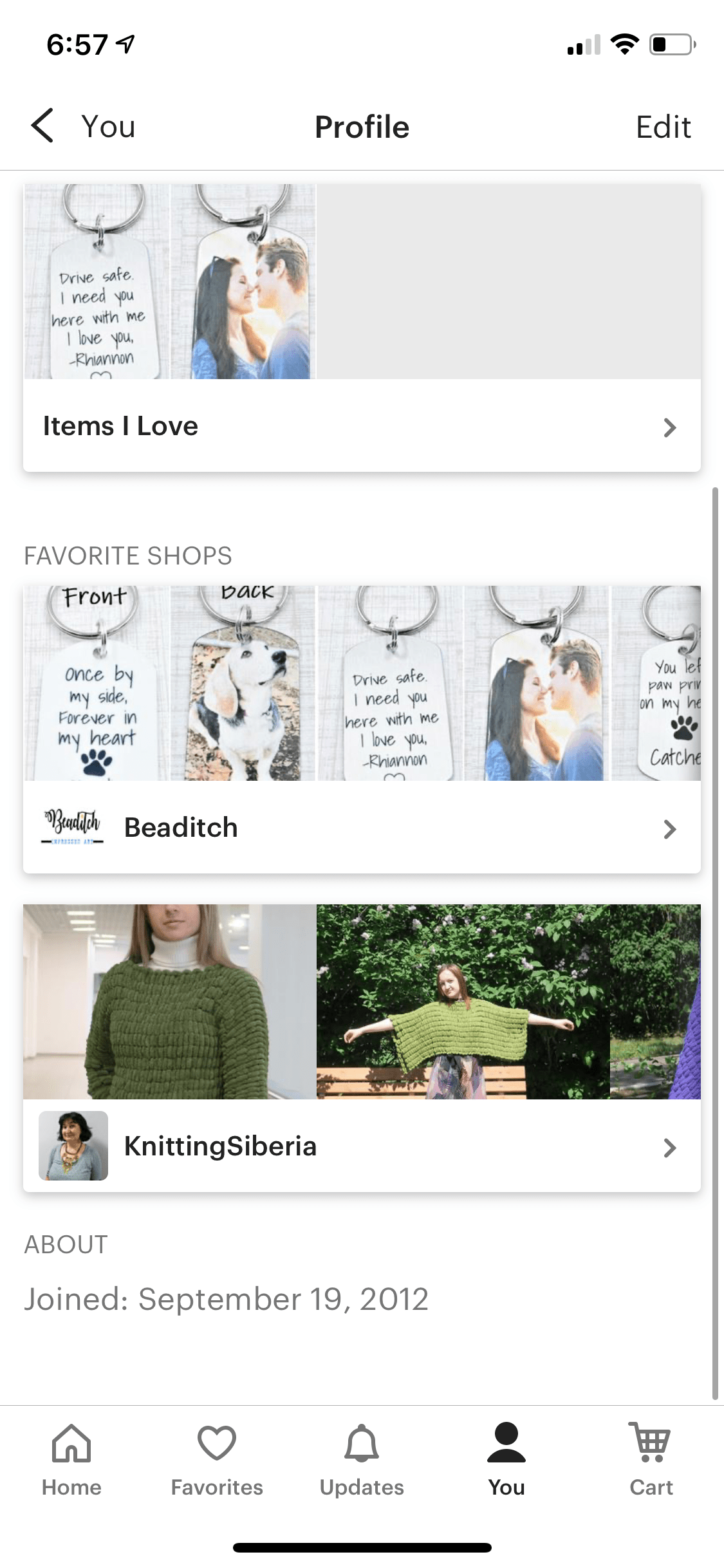
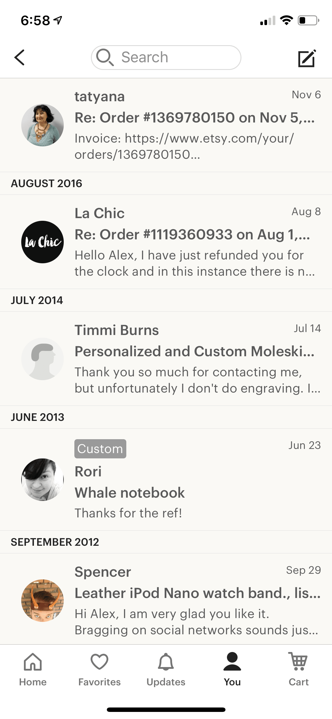
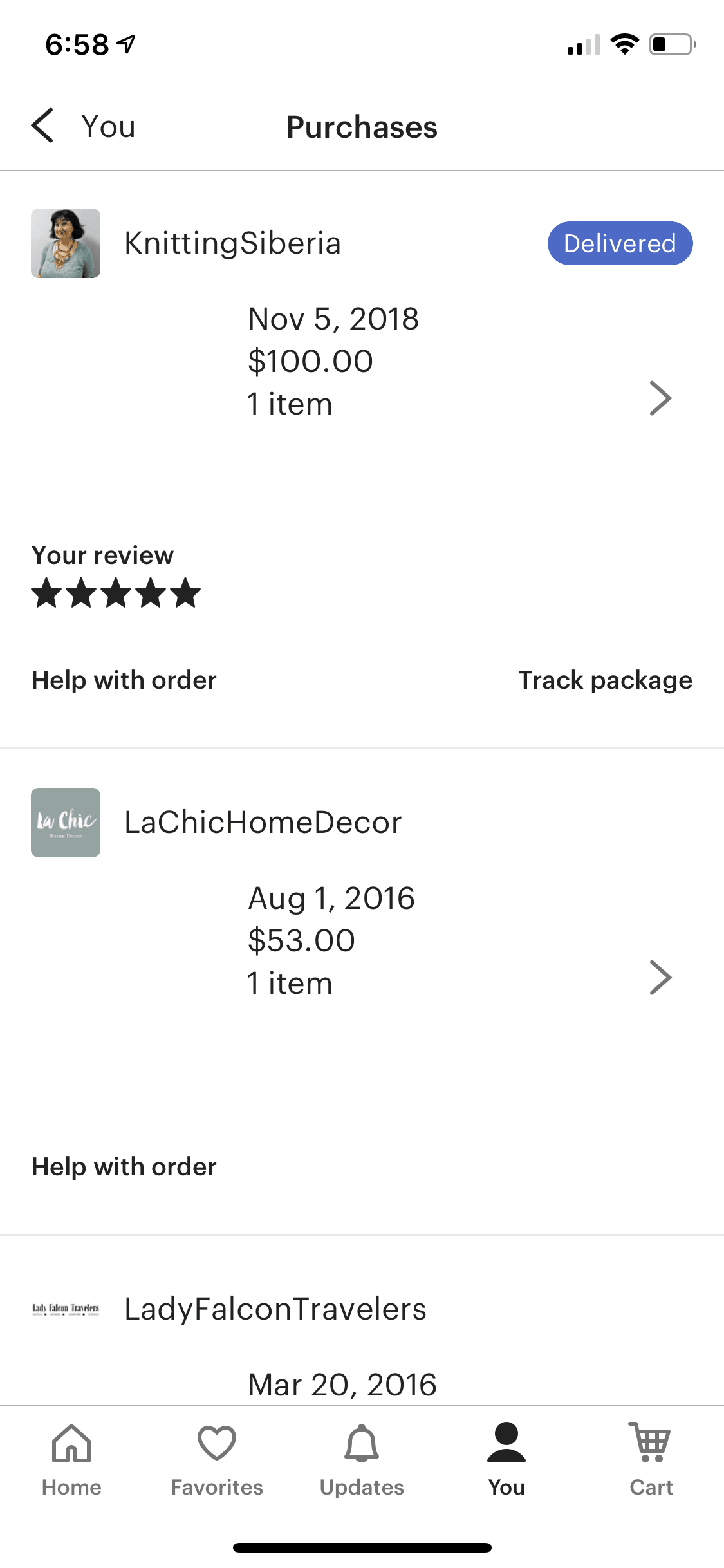
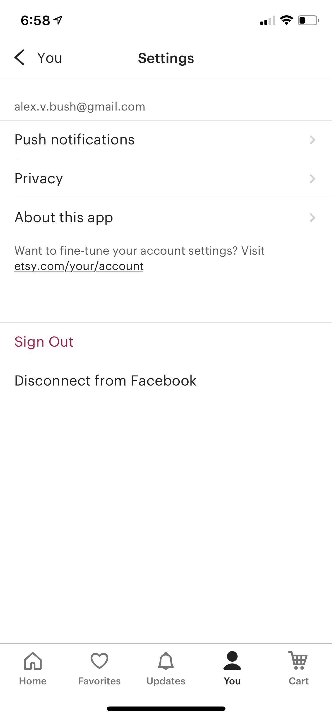
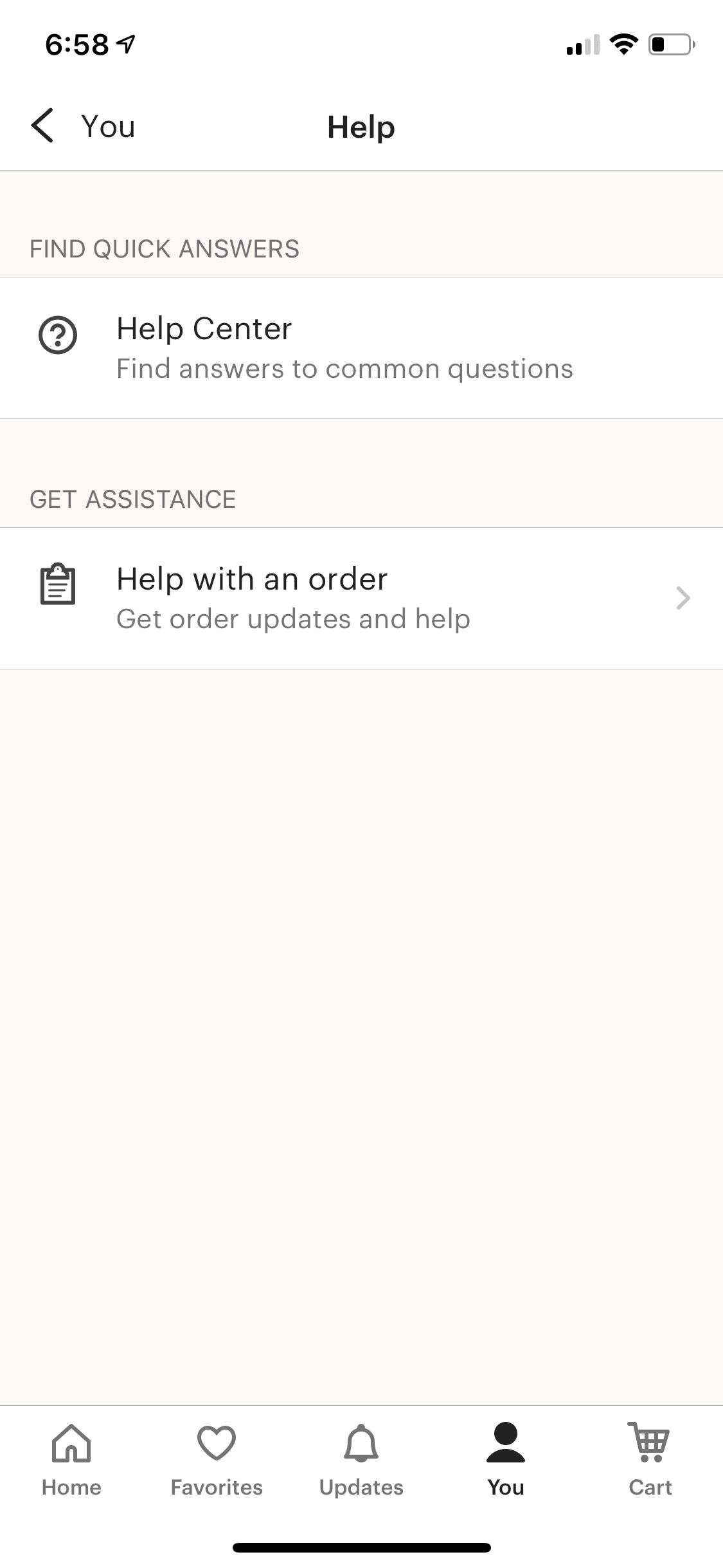
Note that a lot of screens here either look similar or are exactly the same as the ones used in other parts of the app.
This is another important part of your system design — reusability.
Cart Tab
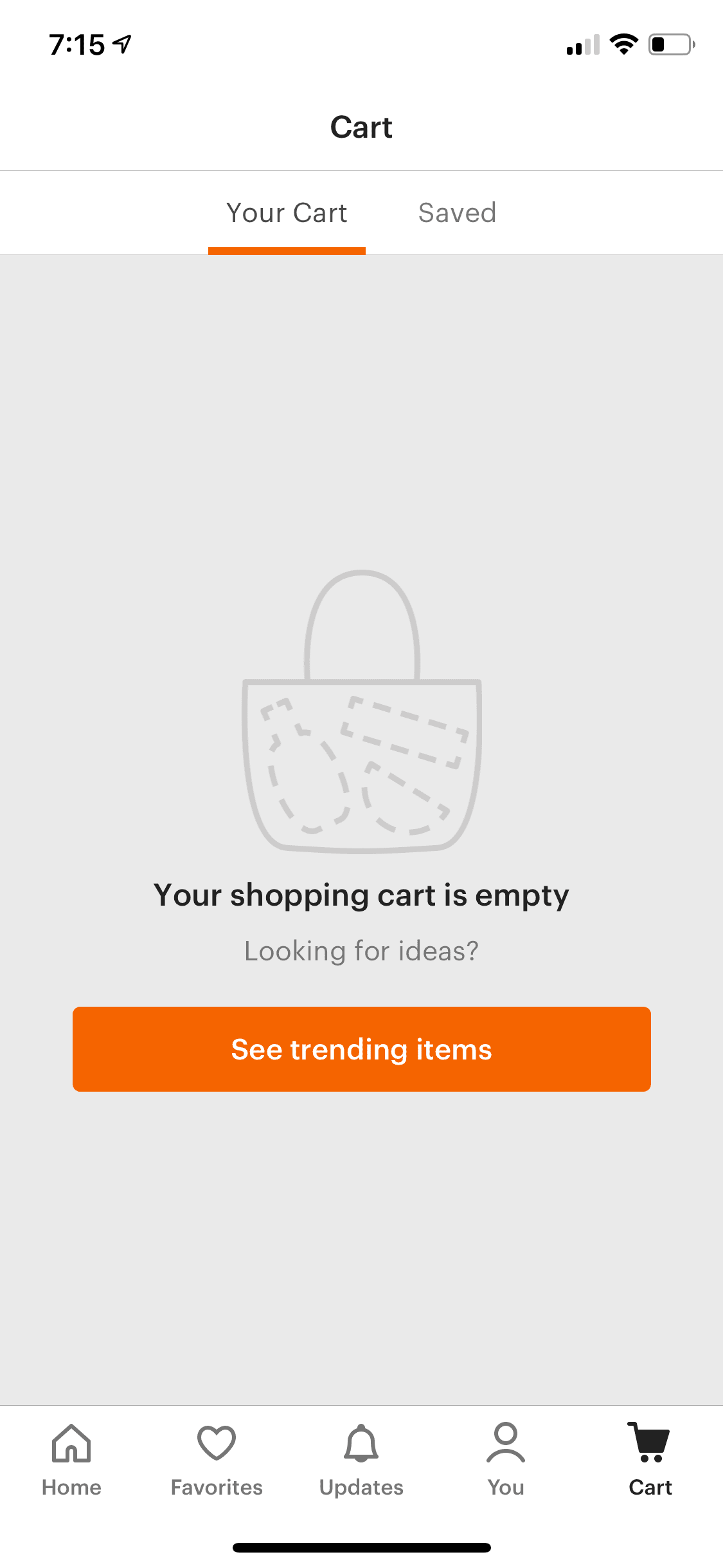
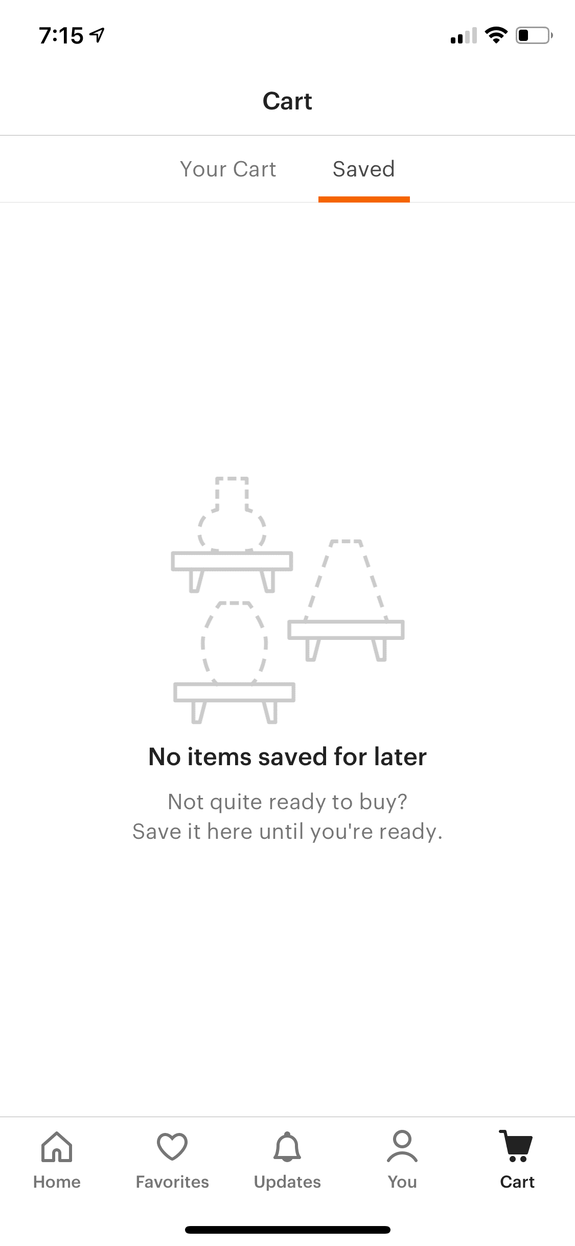
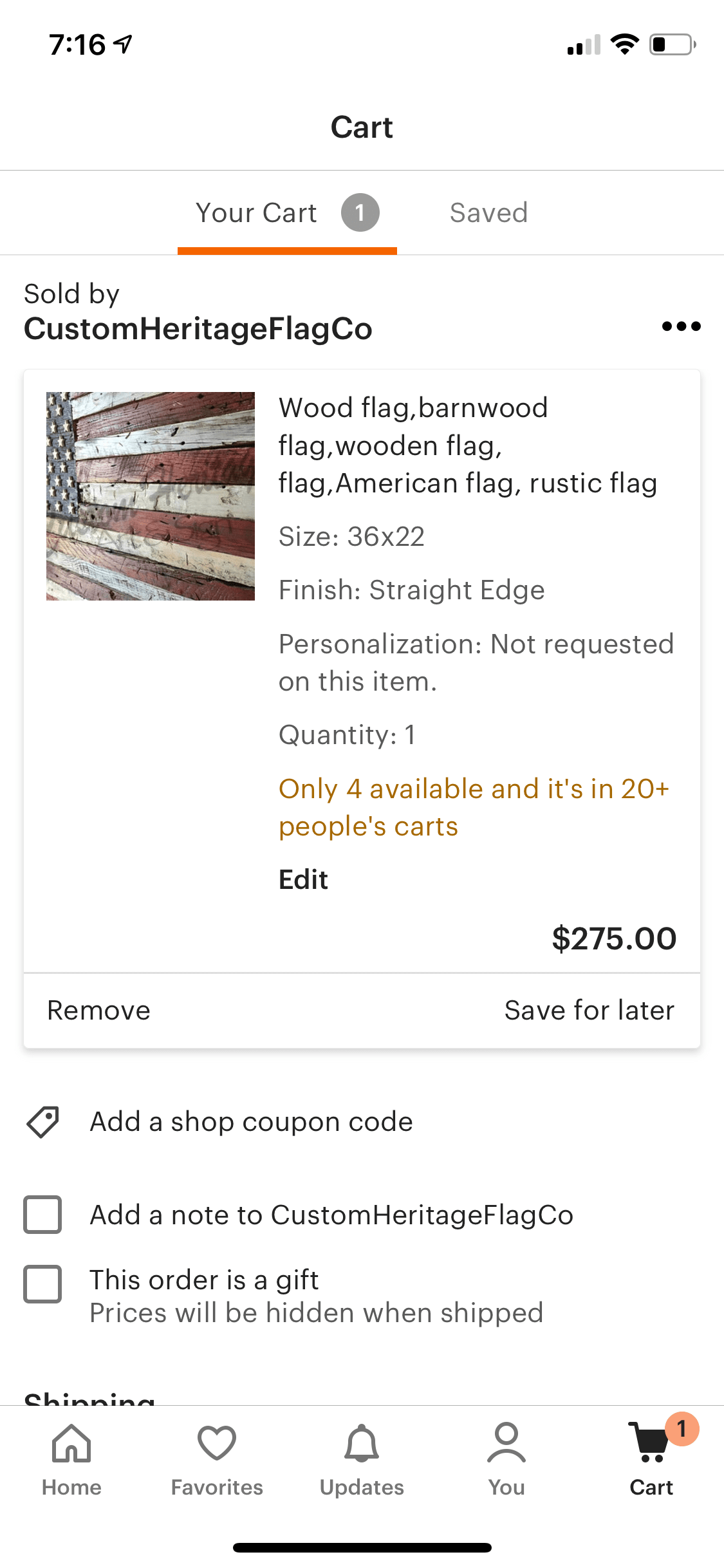
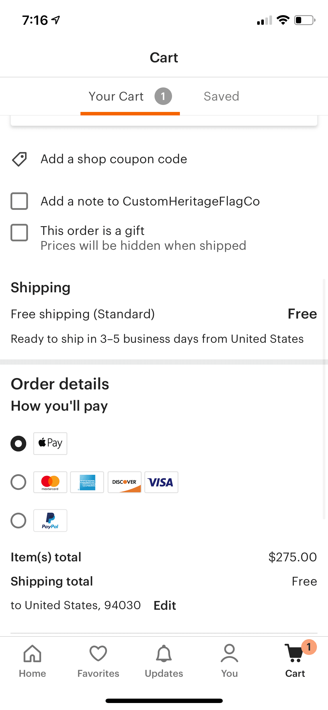
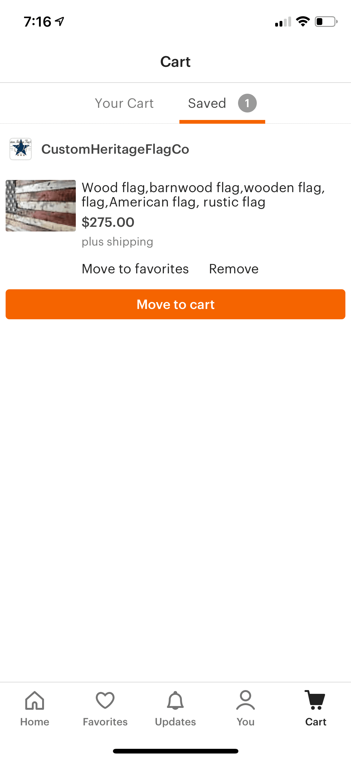
Cart Tab displays the user’s cart and “saved for later” items.
Product Details Screen
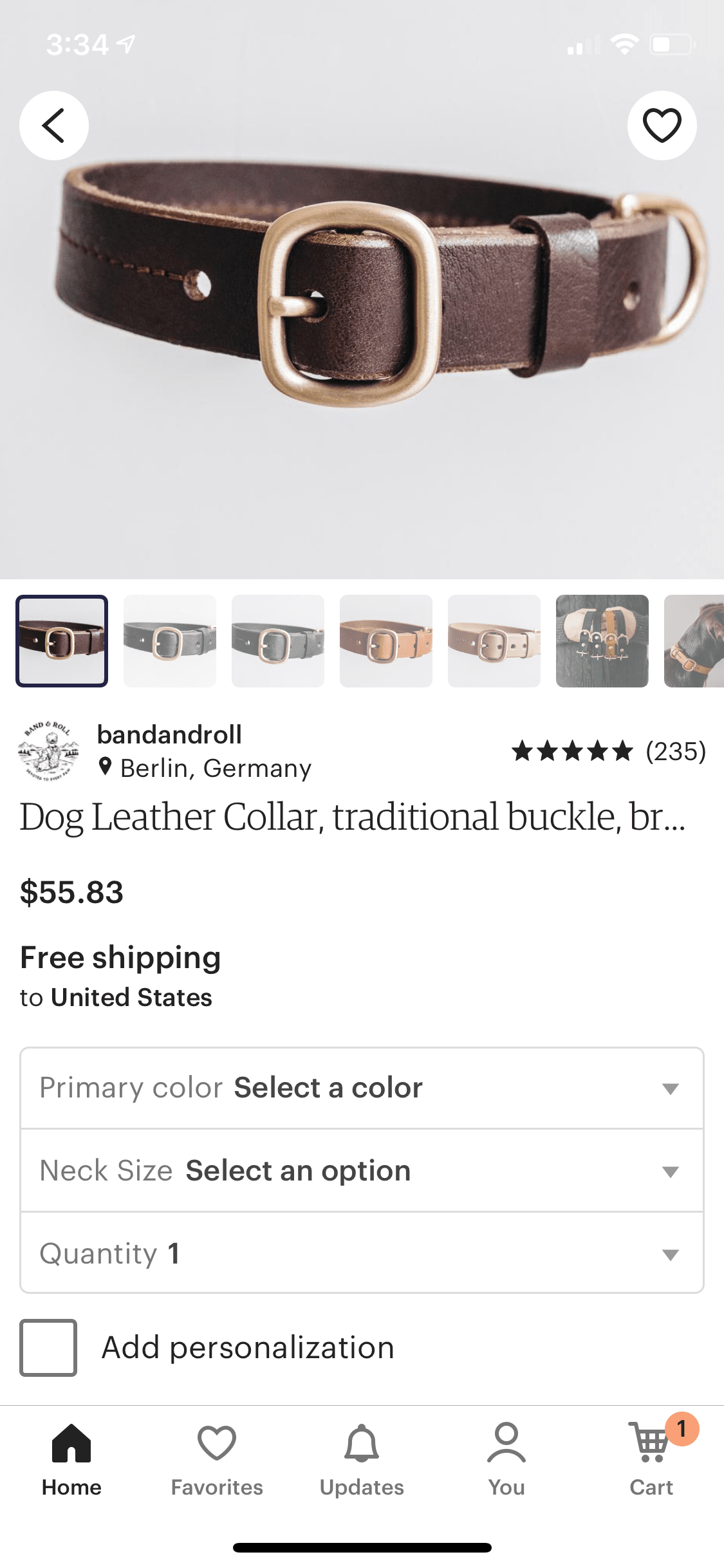
This is the main screen in an e-commerce app. It’s a complex view that displays product data such as title, description, images, shipping information, reviews, related items, etc.
It’s a very complex screen that usually is the one that makes money in an e-commerce app, so it’s crucial to architect it well and make it as extendable as possible. We’ll look into implementation details of this screen in further sections of this article.
What Architecture To Pick
You can pick any architecture you want in your system design interview, but most likely companies that have you go through a system design interview are large and care about scalability. This means using MVC or even MVVM is likely going to be too simple for them.
I recommend going with a full-fledged architecture, such as VIPER, that allows for scale. In this article I’ll be using it as my main architectural approach.
Brief Overview of VIPER
VIPER stands for View Interactor Presenter Entity Router.
View is responsible for drawing data on screen and receiving user input.
Interactor is responsible for business logic of your app.
Presenter massages and formats data and passes it between view and interactor.
Entity is domain models of your application (or sometimes repository).
Router is responsible for navigation in the app.
A VIPER application consists of a collection of VIPER stacks that are organized in a tree structure that starts with the main root VIPER stack. A stack means one group of objects consisting of view, interactor, presenter, entity, router, i.e. a VIPER. As the user progresses through the app, other VIPER stacks are added or removed to drive the UI and business logic of the app. VIPER tree structure maps almost one to one to the view tree of your app.
Overall App Architecture
Earlier, we went over a brief app feature overview of the majority of the screens in the app and can now put together a rough high level app architecture.
We’ll break down our design into two parts: screens and layers
Screens
Screens are the UI and View Controllers hierarchy necessary to build the app’s user experience. It is pretty straightforward.
Upon login, there is a container view controller displayed that holds the bottom navbar (either it’s a UITabBarController or, more likely, a custom view controller) and it has a view controller for the currently selected tab as its child view controller.
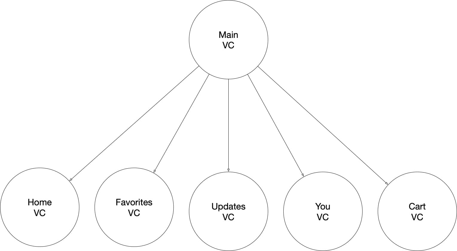
Home VC, Favorites VC, Updates VC, You VC, and Cart VC are container view controllers on their own, holding respective UI/VCs for features in those tabs.
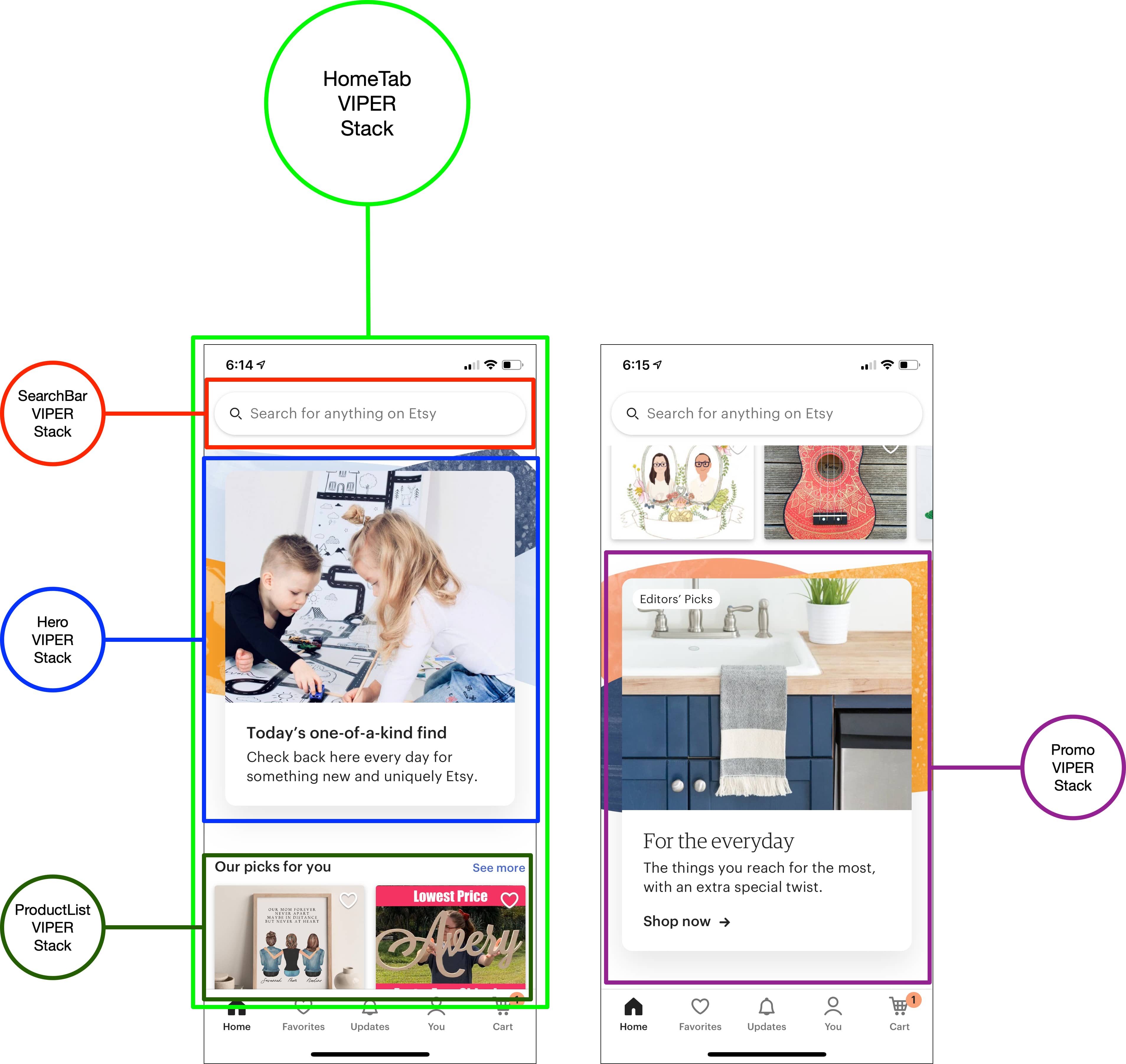
When the user selects one of the tabs, the respective VCs are loaded. For example, for Home Tab there will be Search VC, Promo VC, Hero VC, Products List VC, and other VCs pushed onto the view tree hierarchy.
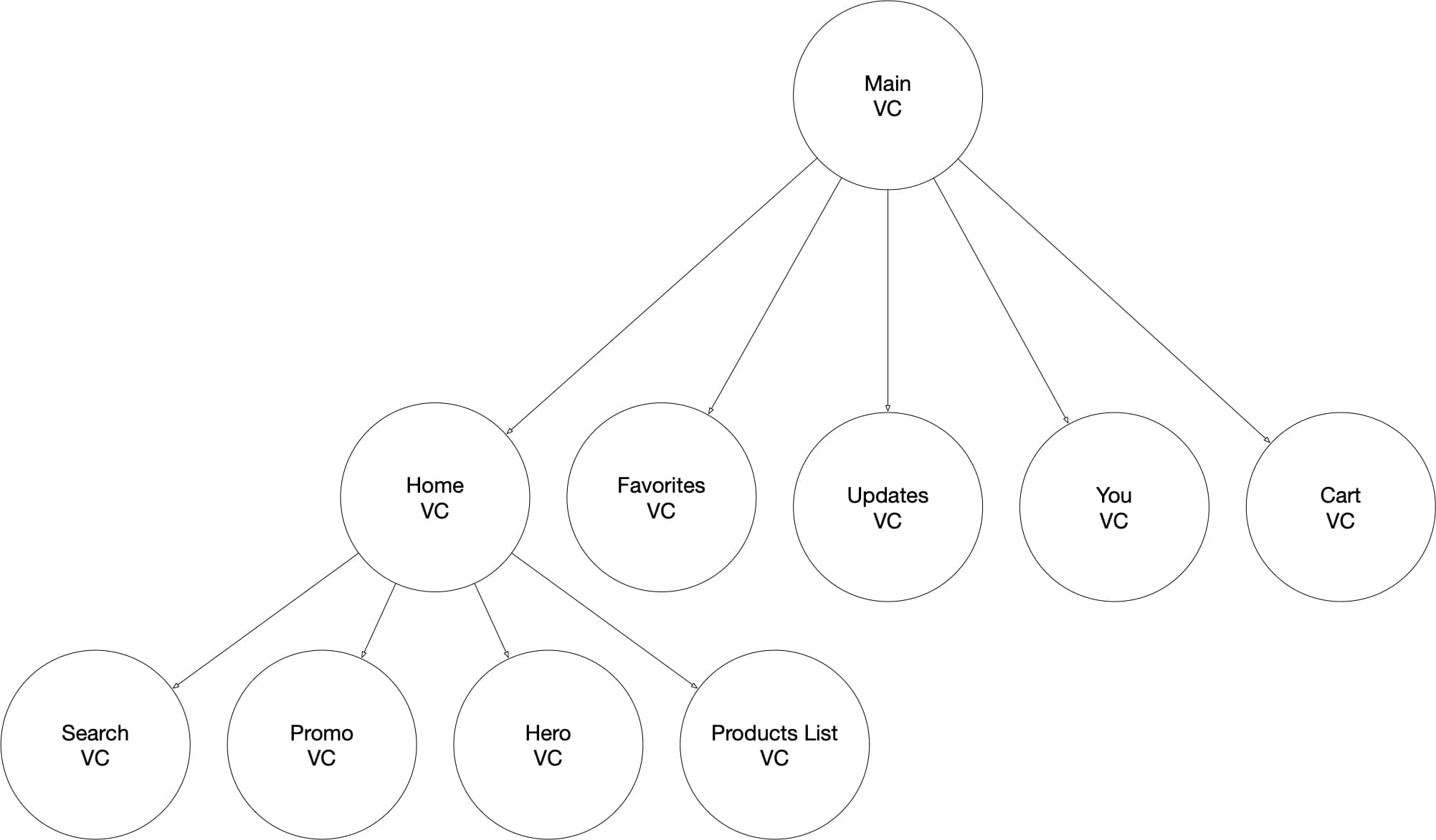
When the user selects an item in Products List VC, the app will push Product Details screen onto the navigation stack.
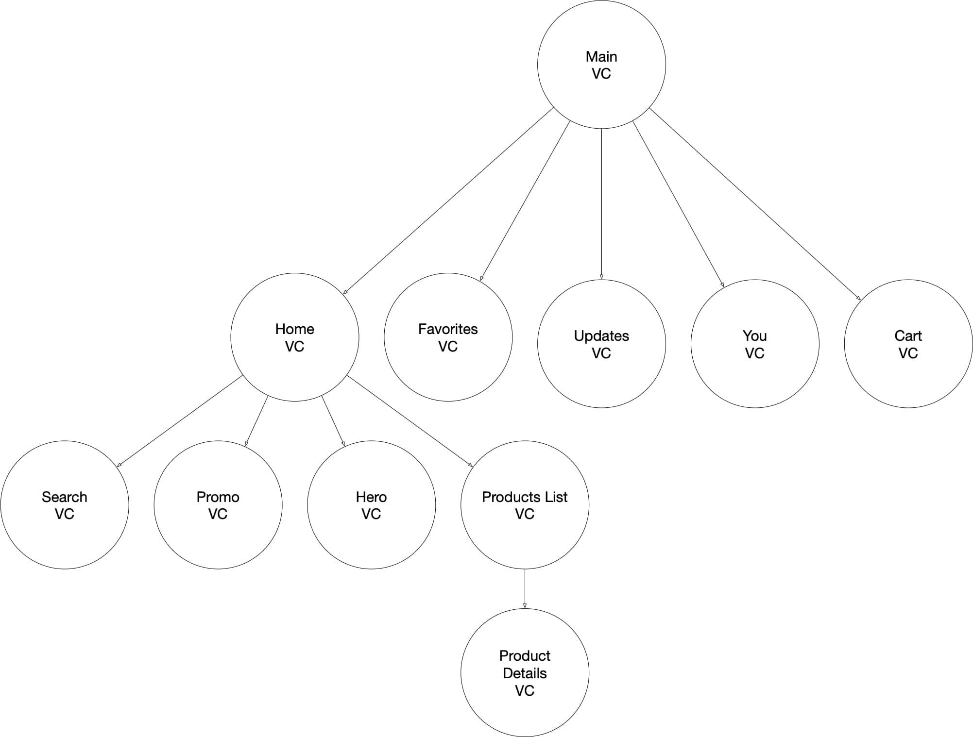
A similar process goes for other tabs.
We will get more into details of Home VC, Products List VC, and Product Details in later sections of this article.
Layers
By layers of our application, I mean the breakdown of all the objects we would need to play the roles and perform responsibilities every application needs. These layers are: UI layer, networking/service layer, storage layer, and business logic layer.
UI Layer
UI layer consists of all the view controllers, their UI elements, their hierarchy, and all the auxiliary objects related to the UI, which can include view models, presenters, and more, depending on the architecture and the design patterns you pick.
Networking/Service Layer
Networking/Service layer consists of all the objects that do external communication in Etsy app. Here you have an HTTP client and service objects that inject that client and use it to communicate with Etsy’s backend API. Services also compose new request objects (create HTTP headers, params, sign and encrypt them, etc.), receive JSON/XML responses, and parse and map the responses to domain model objects.
Storage Layer
Storage layer consists of all the objects responsible for storing data. Usually, in this layer you’d have Core Data/Realm/SQL/File Manager/UserDefaults/etc. and wrappers around them. But in our case, Etsy app doesn’t seem to have any persistent storage, so this layer will only consist of storage objects that use in-memory arrays and dictionaries to store data ephemerally (i.e. not persist it between app launches or memory wipes). The only data that is persisted between launches of the app is about the user and user session.
Business Logic Layer
Business logic layer consists of all the objects that make the app useful to the user. These are interactors, presenters and/or coordinators/routers in Etsy app that use objects for the other three layers to do useful work for the user, such as display data, issue search requests, put items in cart, favor items and stores, checkout, etc. This layer is the most important part of Etsy app because it orchestrates objects from other layers and defines what makes the app useful. Every other layer is just an implementation detail that can be replaced.
Dependencies
App dependencies that the business logic layer of an Etsy application will need are:
| Business Logic Layer | UI Layer | Networking/Service Layer | Storage Layer |
|
….Various View Controllers…. |
|
|
|
….Various Presenters…. |
|
|
| ….Various Interactors…. | ….Various View Models…. |
|
|
|
|||
|
|||
|
|||
|
|||
|
|||
|
|||
|
|||
|
|||
|
The above list is not comprehensive but captures most of the objects you need to architect Home Tab and Product Details screen. We’ll go over interactors and view controllers later in the article.
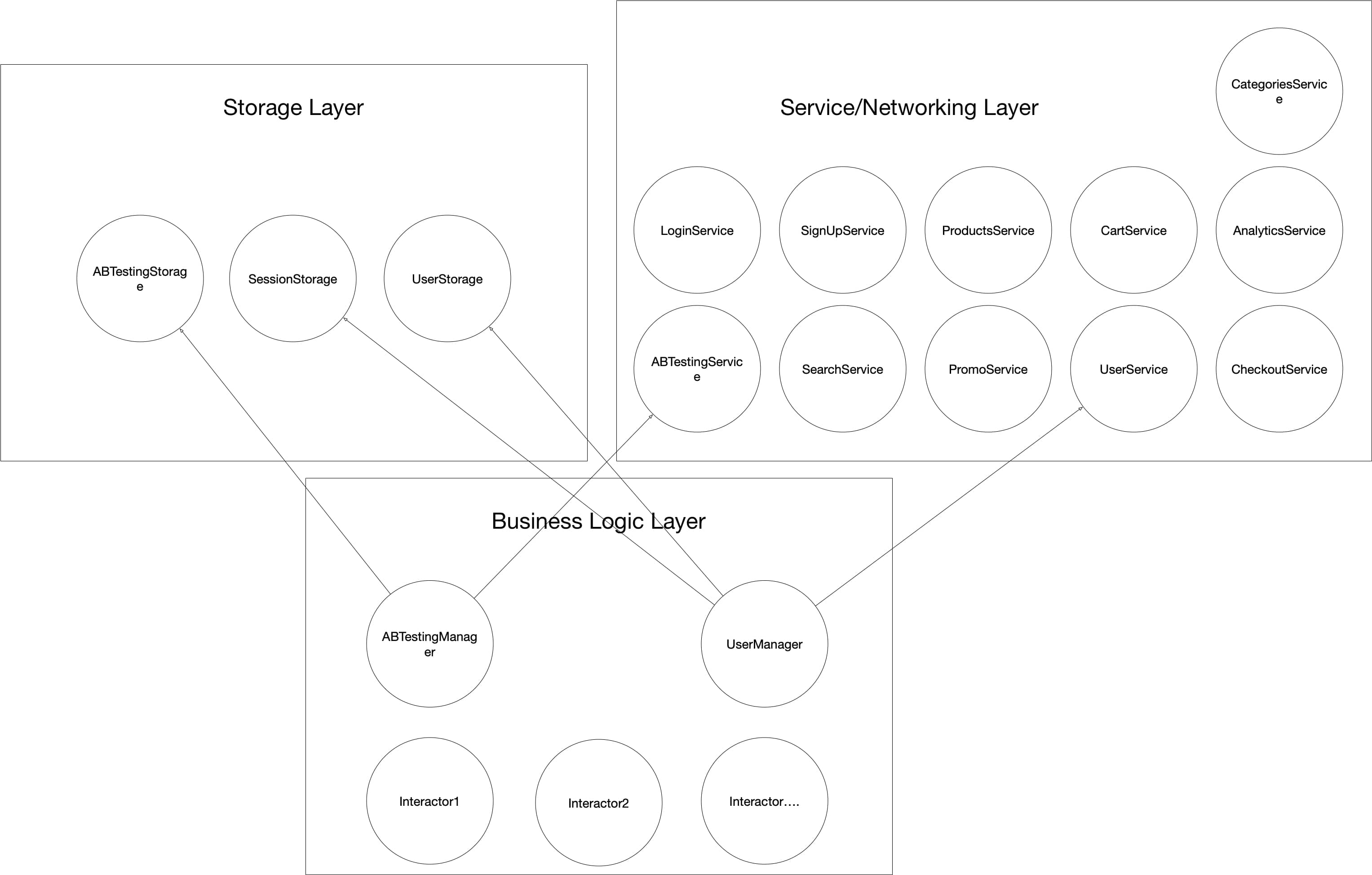
SessionStorage is responsible for storing the current user’s session; (i.e. if there is a session, the user is logged in; if there is no session, it’s a guest user).
UserStorage is responsible for storing local data about the user such as name, profile URL, etc.
ABTestingStorage is responsible for persisting A/B testing variations and feature flags.
LoginService is used upon login to make login requests with the user’s credentials and to parse login responses. It returns user data and current session upon success.
SignUpService is responsible for making new user signup requests and receiving and parsing/mapping new user signup responses. It will get back a user object and session object as the result of the signup request.
ProductsService is used to make product list requests (e.g. for Home screen) and to make product details requests for individual products.
CartService is used to make requests to retrieve cart data.
ABTestingService is used to get feature flags and A/B testing variables from the backend.
SearchService is used to get paginated lists of products for user search queries.
PromoService is used to get promotion banner content, image URL, and any other related data.
UserService is responsible for making requests to get data for the current user, such as username, profile picture, etc.
AnalyticsService is responsible for sending analytics data to the backend. Every time an interactor/presenter tracks a view, it will use this service to send Event objects to the backend.
CategoriesService is responsible for fetching lists of categories available in Etsy app.
CheckoutService is used to send requests to checkout and place orders.
UserMananger is responsible for managing the current user’s data. It uses SessionStorage, UserStorage, and UserService to fetch and store user data.
ABTestingManager uses ABTestingStorage and ABTestingService to get and persist feature flags and A/B testing values in the app.
Domain Models
Some of domain models that an Etsy app will need that will be coming from the backend are:
| Session | User | Product | Price | ShippingInfo |
| SearchResult | Store | Cart | ABTest | ABTestVariation |
| Promo | Event | Category | ….. | …… |
There are many more that I either omitted or that could be added, based on the specific implementation that you pick. But the domain models above are likely the bare minimum you’d have to be receiving from the backend.
Session represents a concrete session for a logged in, authenticated user using the app. Session object contains a token that is used to sign most of the requests in services to identify and authorize the user or to personalize response data.
User represents the current user with his or her username, name, profile URL, etc.
Product represents an individual product displayed in product lists. It has product name, image URL, product description, average review’s rating, etc. It also has Price, ShippingInfo, and Store in it as standalone models, as they are more complex data structures.
Price represents price calculation with or without applied discounts, promotions, etc.
ShippingInfo represents specific shipping data relative to the user’s address.
SearchResult represents a paginated list of products for a given search query.
Store represents all the data about a store — name, description, thumbnail image, banner image, etc.
Cart represents the current user’s cart with selected and/or saved products in it.
ABTest represents an individual A/B test and/or feature flag and a corresponding set of values (ABTestVariation).
ABTestVariation represents one specific value for a given ABTest.
Promo represents all the data (title, image URL, etc.) for a promotion banner in the Home Tab.
Event represents one individual event, such as a user tap on a button or a screen/page view. It has associated data, such as event ID, user ID, product ID, etc.
Category represents an individual category of items in the Etsy database. It may either contain subcategories or be a leaf category that has products.
These domain model objects are just structs or classes describing and holding data — they do not contain any logic.
Interactors, Presenters, Coordinator, Routers
Depending on the architecture you pick, the business logic (business logic layer) will go into either interactors, in the case of VIPER, or presenters in Model-View-Presenter or view models in Model-View-ViewModel (MVVM), etc. The main thing is that those objects will be using the dependencies from the list above to do useful work for the user, and then they’ll pass data to the view to render. They’ll also receive input from the view and coordinate navigation throughout the app.
Home Tab Screen
This is one of the most important screens/features that your interviewer will want you to focus on, so we’ll go more into design details of it.
Home Tab Features
To recap, when the user selects Home Tab, he or she sees a personalized list of items consisting of products, stores, categories, recently favorited items/stores, hero and promo banners, etc.
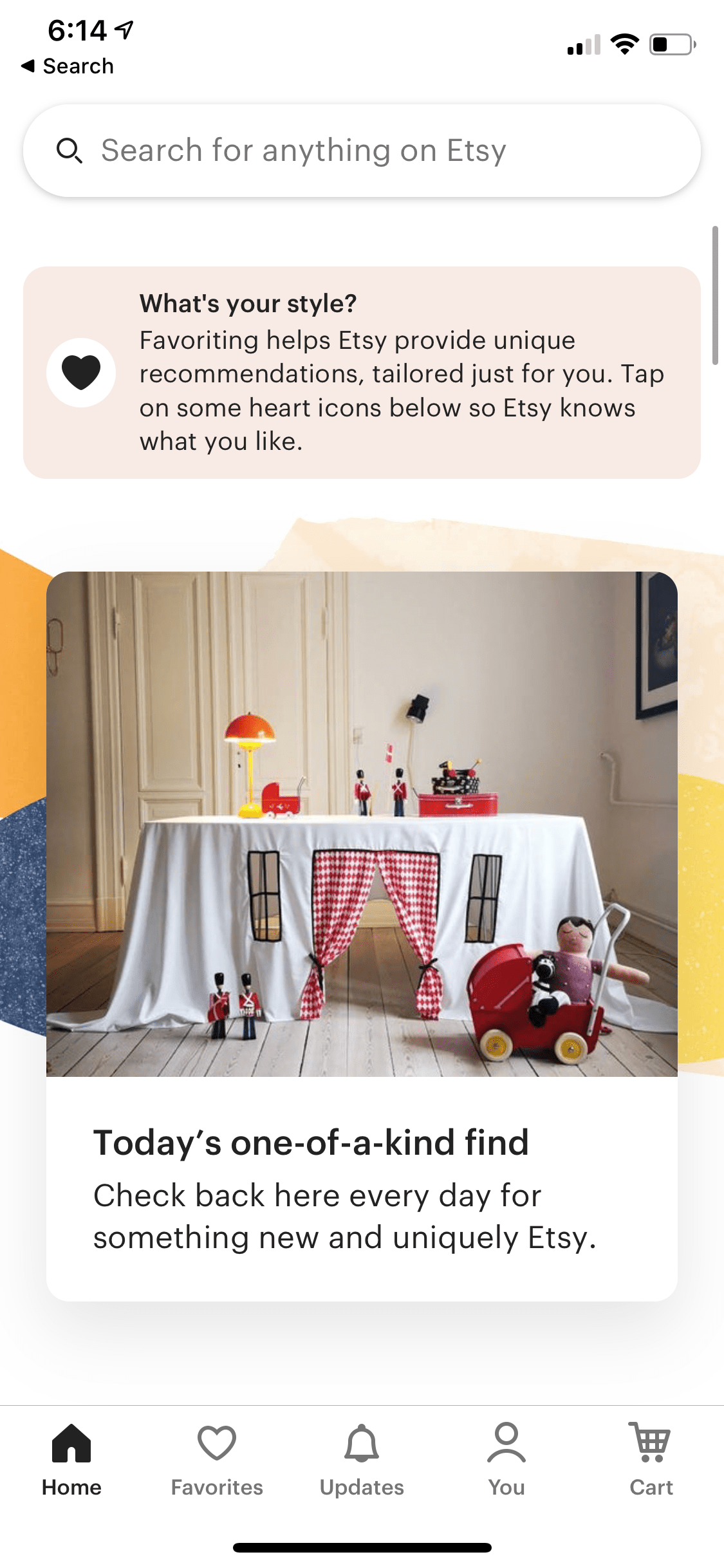

The user can navigate from there by selecting any of these items to view the products list, product details screen, category screen, store screen, and so on.


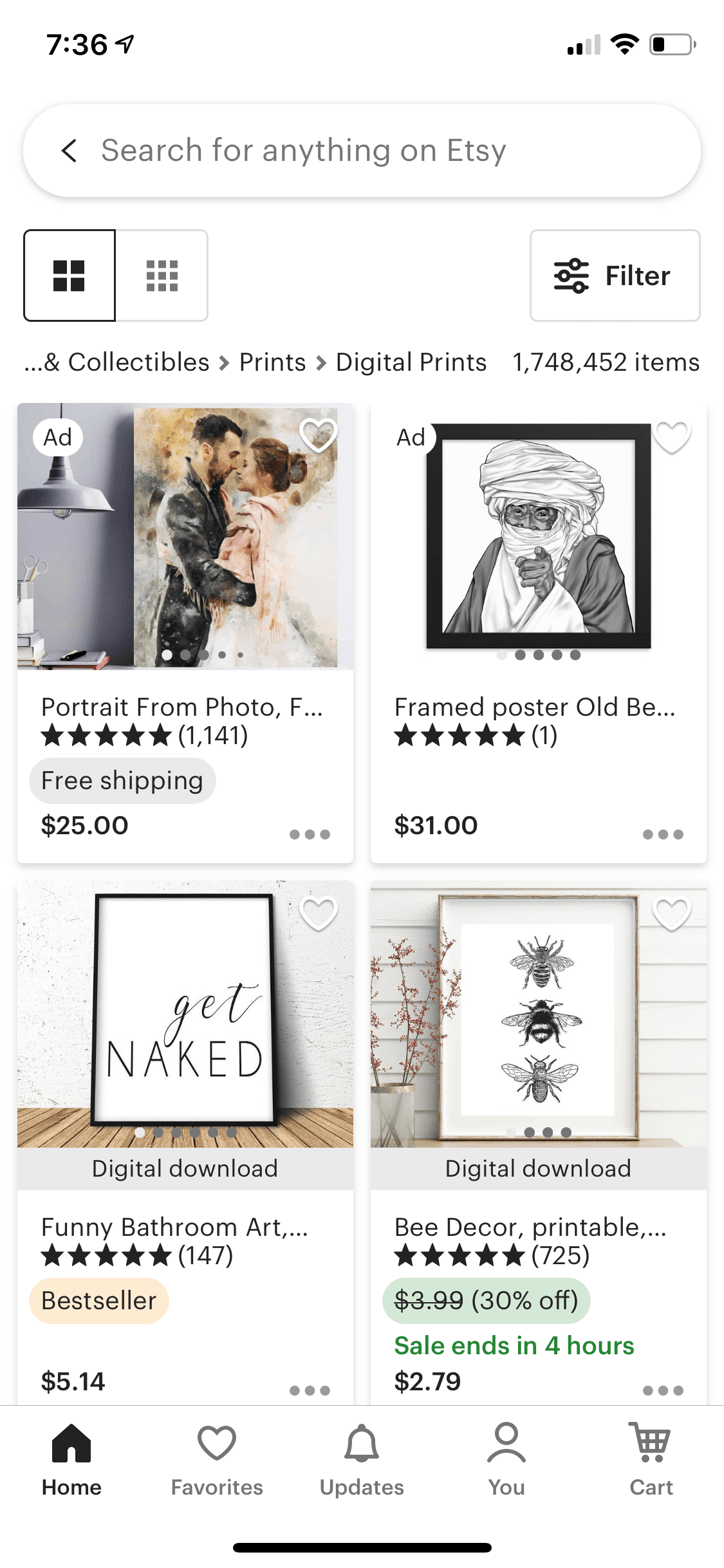

Home Tab Structure
This means that we can extend our app structure diagram to reflect that as follows:
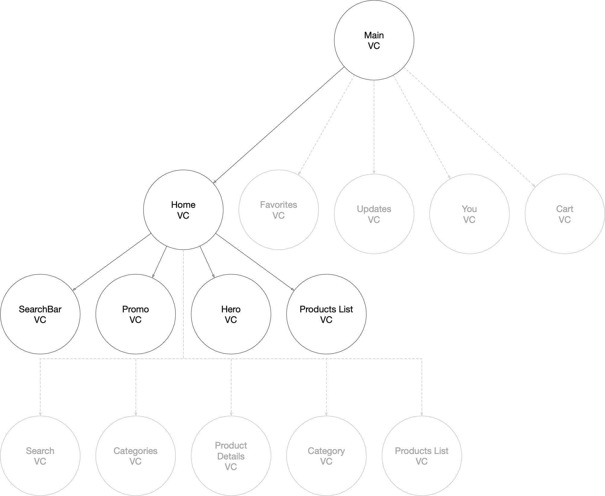
NOTE: Dotted lines and greyed out circles show VCs that could be potentially routed to, but are not visible upon the first launch of the Home screen.
The idea behind this structure is this — Home VC is a container that holds within itself SearchBar VC, Promo VC, Hero VC, Product List VC, and any other VCs for other types of content that needs to be displayed in that screen. VCs for each type of content are added as child view controllers to cells of Home VC collection view.
SearchBar VC displays the search bar; Promo VC, a promotion; Hero VC, any hero content, Product List VC displays product picks, etc.
Home Screen Dependencies & Architecture
Now, let’s wire up all the dependencies needed for the Home screen to work. There are two ways to go about it, and you should ask your interviewer about the system requirements and, based on that, decide which one to choose. The two choices are bundling and unbundling:
- bundle all the data fetching and coordination in Home screen
- split data fetching between children of Home screen
You’d pick the first approach if it is crucial for your app to load all the data first and display it all together.
And you’d go for the second approach if it is crucial for your app to display some content ASAP, and the rest of it can be loaded and rendered lazily as the app receives the data.
Neither approach is better or worse; it’s just a matter of product/UX choice and your Project Managers should know better than you and have more data and context to make this decision.
In our example, we will go with the second approach as it’s more complex.
Dependencies for each VC look like this:
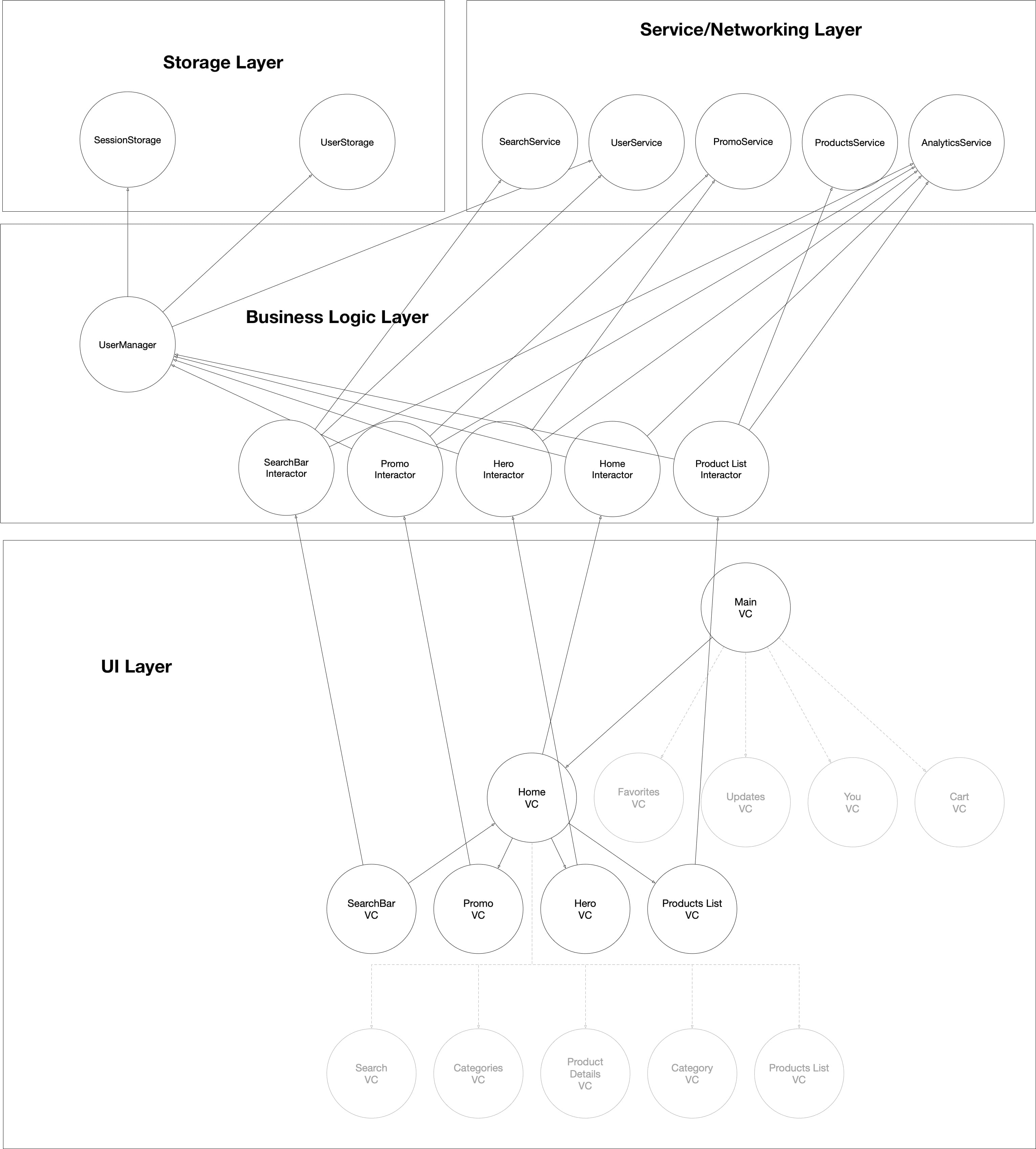
As you can see, each VC has a corresponding interactor object. (In VIPER there is also a presenter between them, but I omitted it so as not to crowd this already crowded diagram).
Each interactor takes care of the business logic for its specific part of the screen, and it uses dependencies to do so.
Let’s take a look at each VIPER stack in detail:
Home VIPER Stack
HomeVC acts as a container and depends on HomeInteractor for business logic.
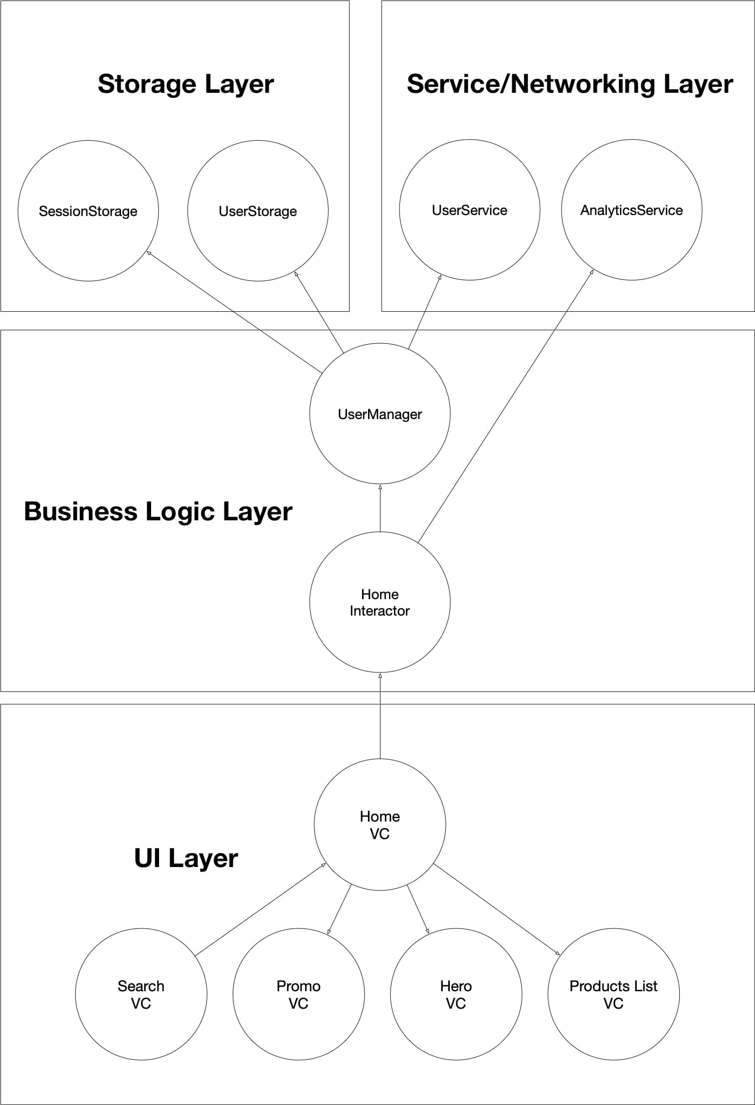
HomeInteractor depends on AnalyticsService and UserManager. It uses AnalyticsService to track when the tab was selected and when the user sees the Home screen again. It uses UserManager to get user ID and other necessary data for analytics and passes it down to children VIPER stacks as their dependency.
SearchBar VIPER Stack

SeachBarVC dispalys the search bar view. It depends on SearchBarInteractor for business logic.
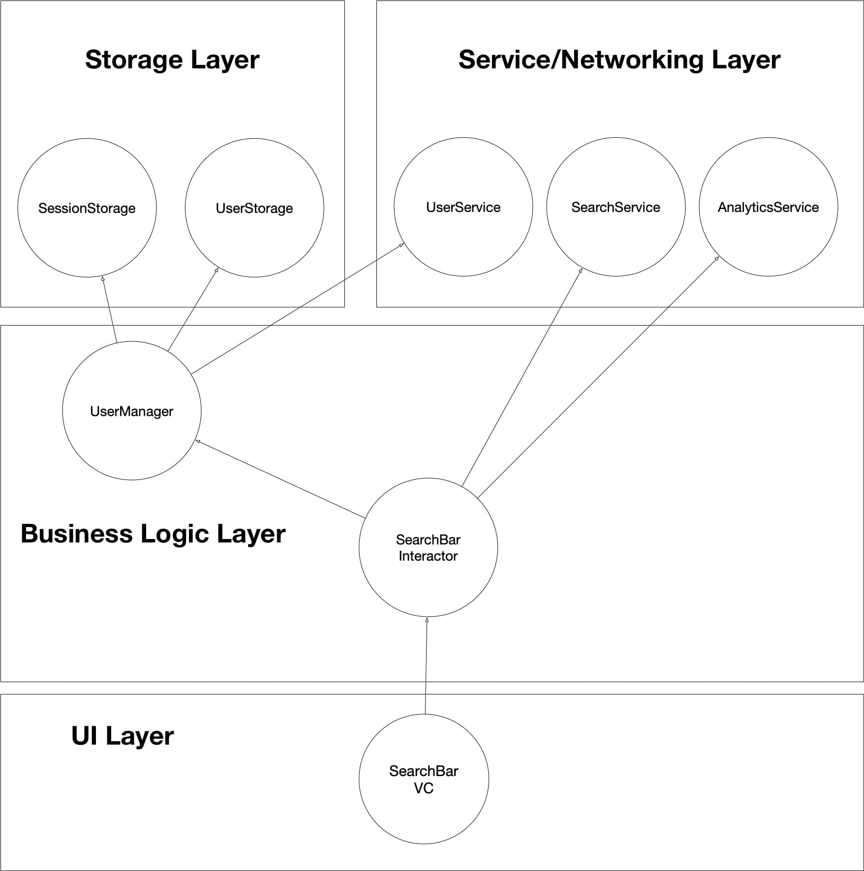
SearchBarInteractor depends on SearchService, AnalyticsService, and UserManager. It uses AnalyticsService to track when the view was displayed and tapped on. UserManager and SearchService are passed to the next Search VIPER stack as the user starts the search.
Product List VIPER Stack
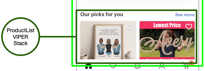
ProductListVC displays the list of product picks and depends on ProductListInteractor for business logic.
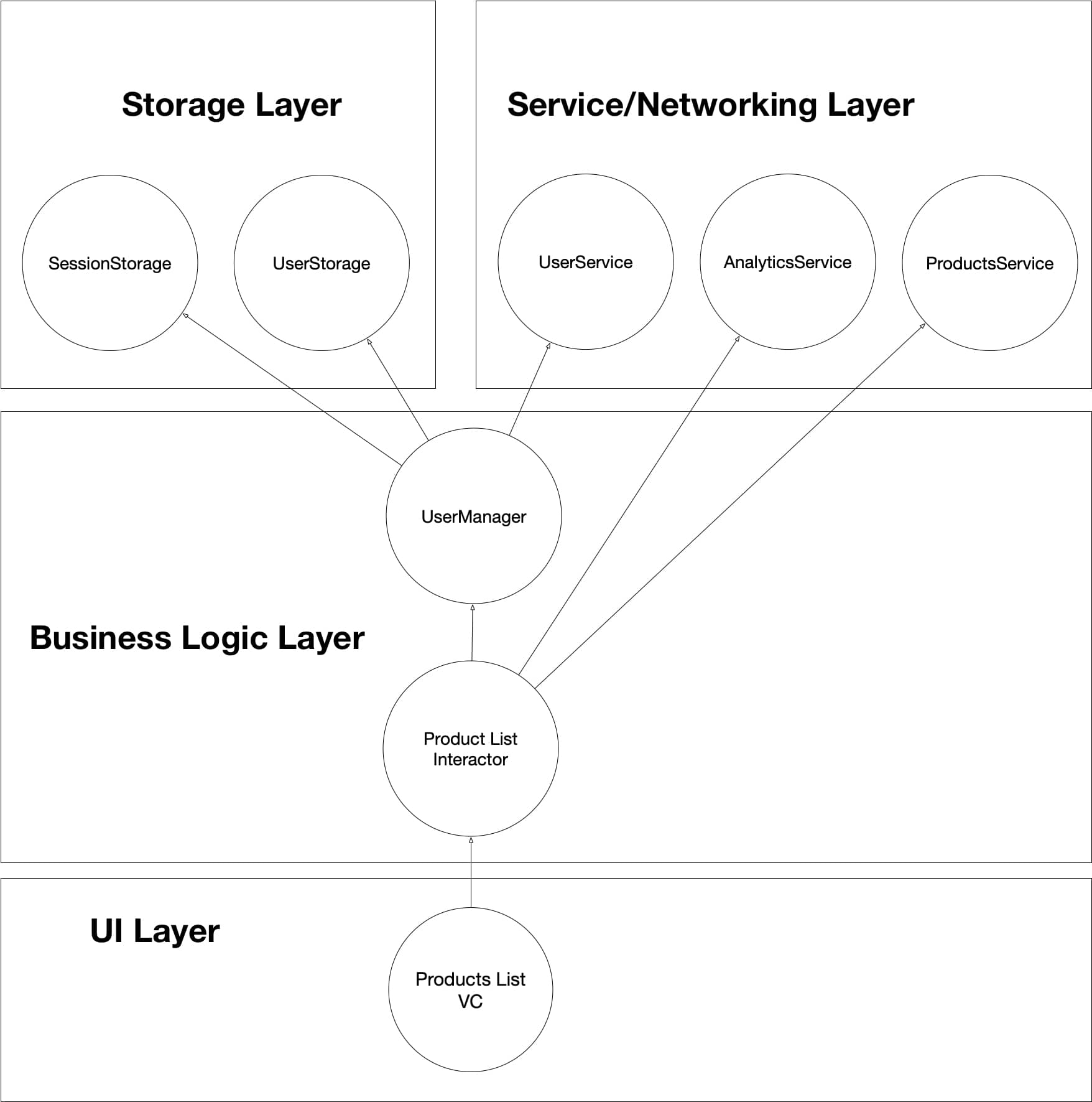
ProductListInteractor depends on ProductsService, AnalyticsService, and UserManager. It uses products service to fetch product picks, UserManager to get the current user’s details, such as user ID, to be used in products fetch requests for personalization, and AnalyticsService to track when this view was displayed, started to fetch data, finished fetching data, etc.
Hero & Promo VIPER Stacks
These two VIPER stacks are pretty similar and have a high chance of being exactly the same stack that is reused twice. In this case, for illustration purposes, I’ll assume they have two very distinct functionalities that justify the split.
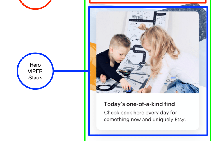
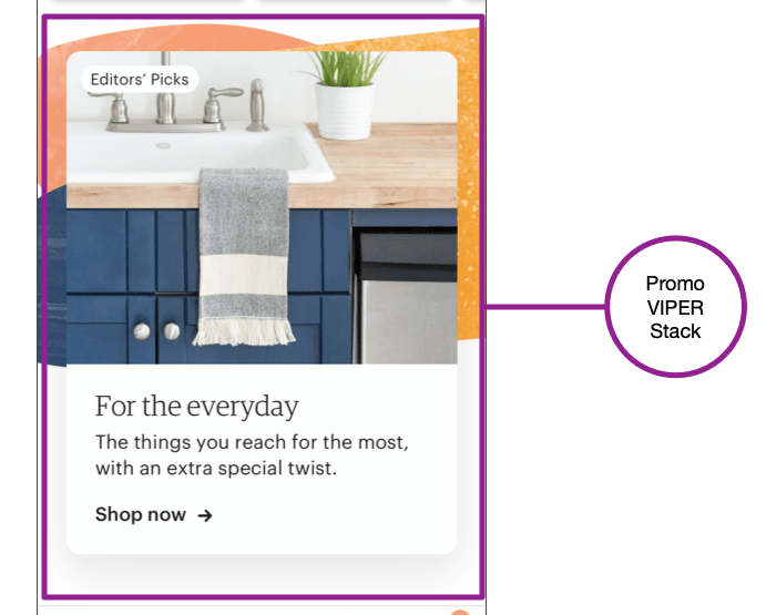
Hero and Promo VCs are pretty similar. They display respective hero and promo banner views.
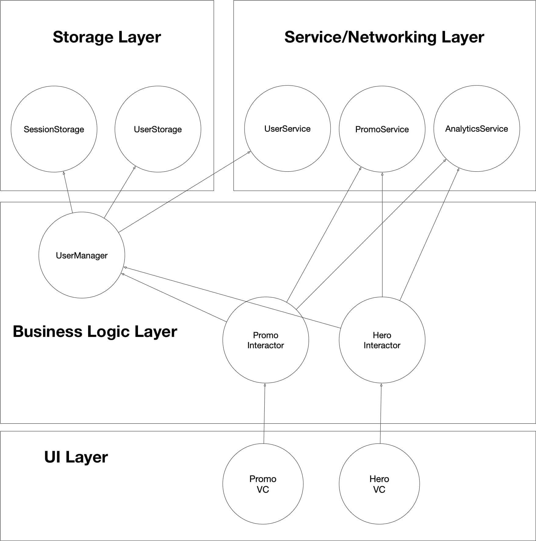
Both HeroInteractor and PromoInteractor depend on PromoService, AnalyticsService, and UserManager. PromoService is used to get the data for hero and promo content from the backend, and UserManager is used for personalization. AnalyticsService tracks which views are displayed and tapped on.
NOTE: Notice that we don’t have a standalone HeroService that fetches data for Hero VIPER stack but instead reuse PromoService. This is done for illustration purposes; likely in the actual Etsy app, those are two separate concerns, but, in our example, I decided to mix them together in one service to illustrate that they could be used by different interactors.
Data Flow in Home Screen
The data flow in the Home screen is delegated to each individual VIPER stack. When Home VIPER stack is initialized and displayed on the screen, it routes to and attaches SearchBar, Hero, ProductList, and Promo VIPER stacks. Those stacks will render their own UI, then their respective interactors will fetch the data they need and tell the UI to refresh itself. This way, we achieve decoupling of Home screen from concrete types it might contain and let them fetch their own data, which means we can add as many other VIPER stacks to that screen in whatever order we want.
For example, this is how data will flow in ProductList VIPER stack:
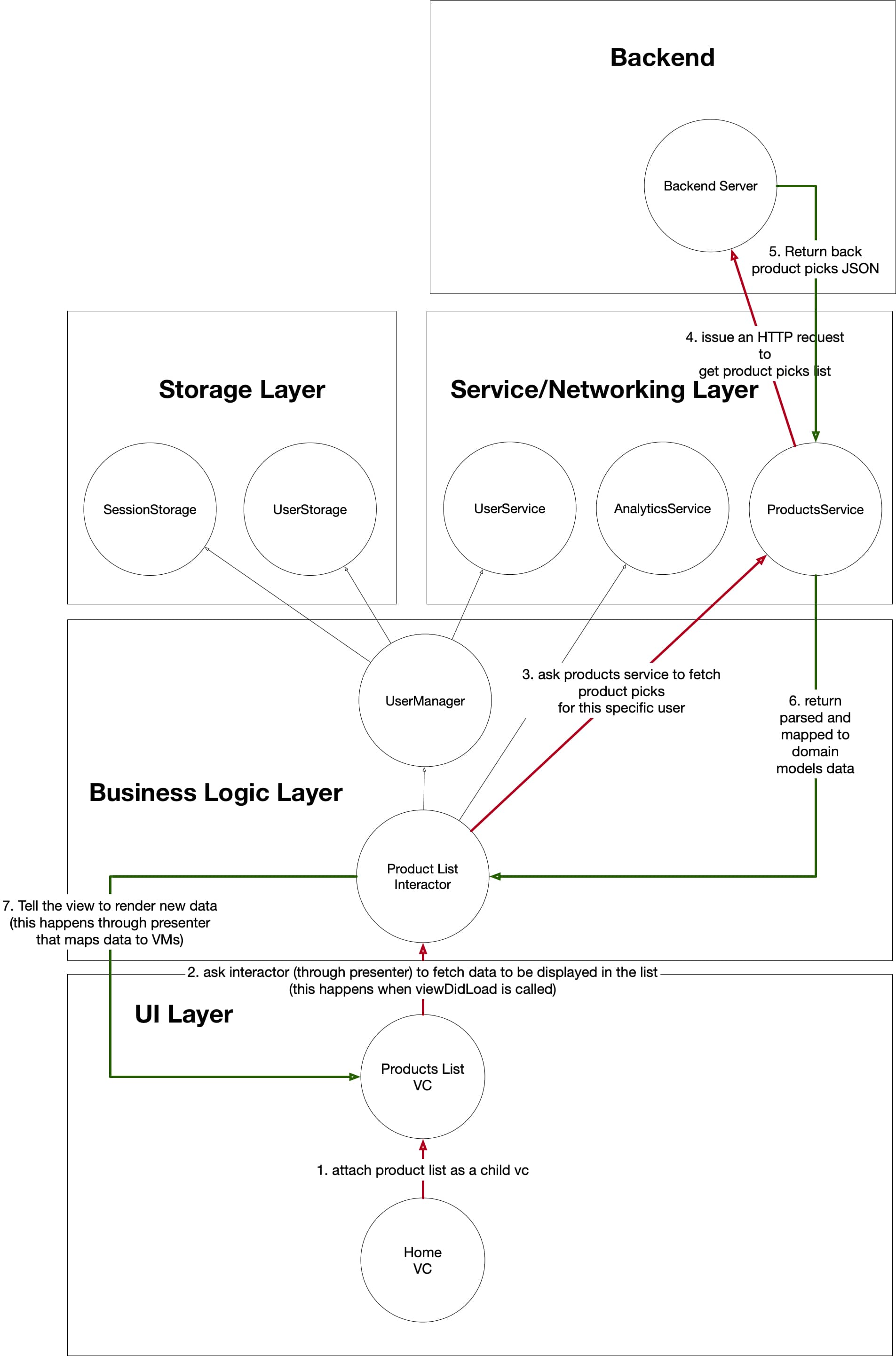
- When Home VC attaches ProductList as its child view controller ,ProductList VIPER stack’s life cycle is triggered.
- On ProductListVC’s viewDidLoad, it asks its interactor (through presenter as a proxy) to fetch the data to be displayed.
- ProductListInteractor uses its dependency, ProductsService, to get the data from the backend.
- ProductService puts together an HTTP request to fetch product picks.
- ProductService receives back a response from the backend with JSON representation of product picks for the user.
- ProductService maps the JSON it got to domain models and returns the result back to ProductListInteractor.
- ProductListInteractor tells the view (through presenter as a proxy) to render the new list of product picks.
Data flows in a similar fashion in the other children VIPER stacks of Home Tab. Each is individually responsible for their respective scopes of the app.
Product Details Screen
Now, let’s take a look at another complex screen that you’ll likely be focusing on in your system design interview — Product Details screen.
To recap — the user can get to this screen from many different parts of the app where products (likely in lists) are displayed.
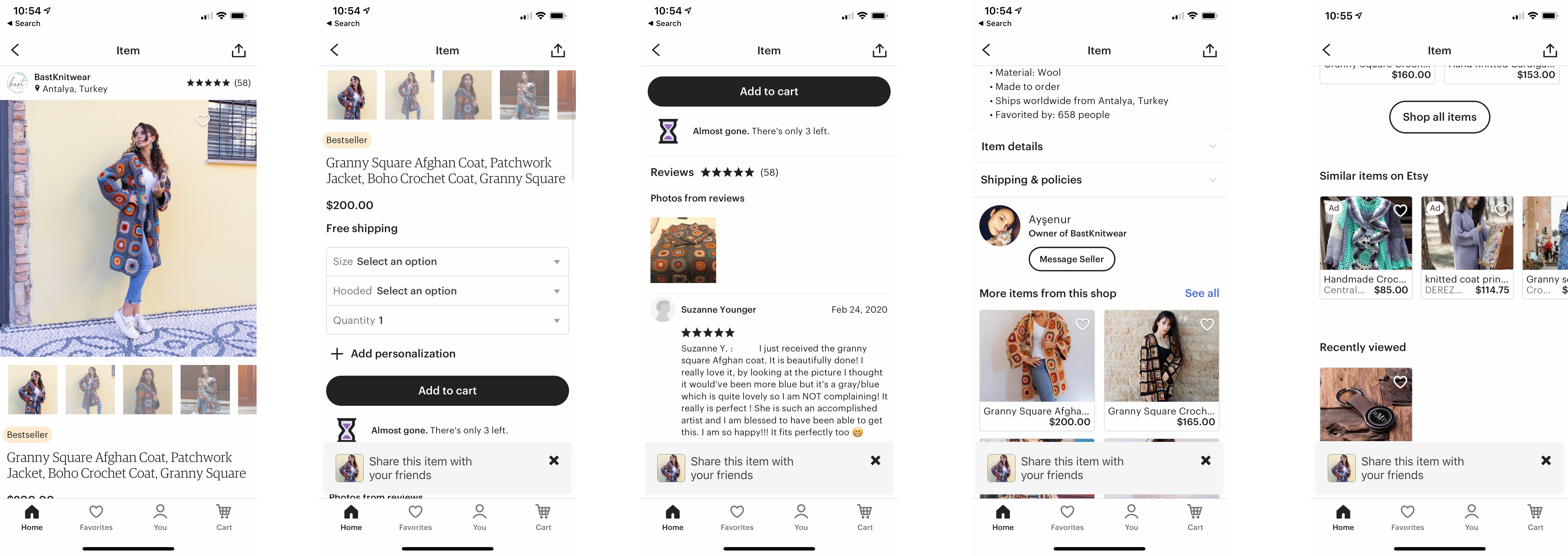
Product Details Features
Product Details screen has many features such as:
- displaying product title
- displaying product description
- displaying carousel of product images
- displaying product store
- displaying product reviews count and average rating
- displaying product tags
- displaying product price
- displaying product shipping info
- displaying product variation picker and letting the user pick different variants
- displaying product quantity picker and letting the user change product quantity
- adding product to cart
- and many more
The user can also navigate to product reviews, other product lists, etc.
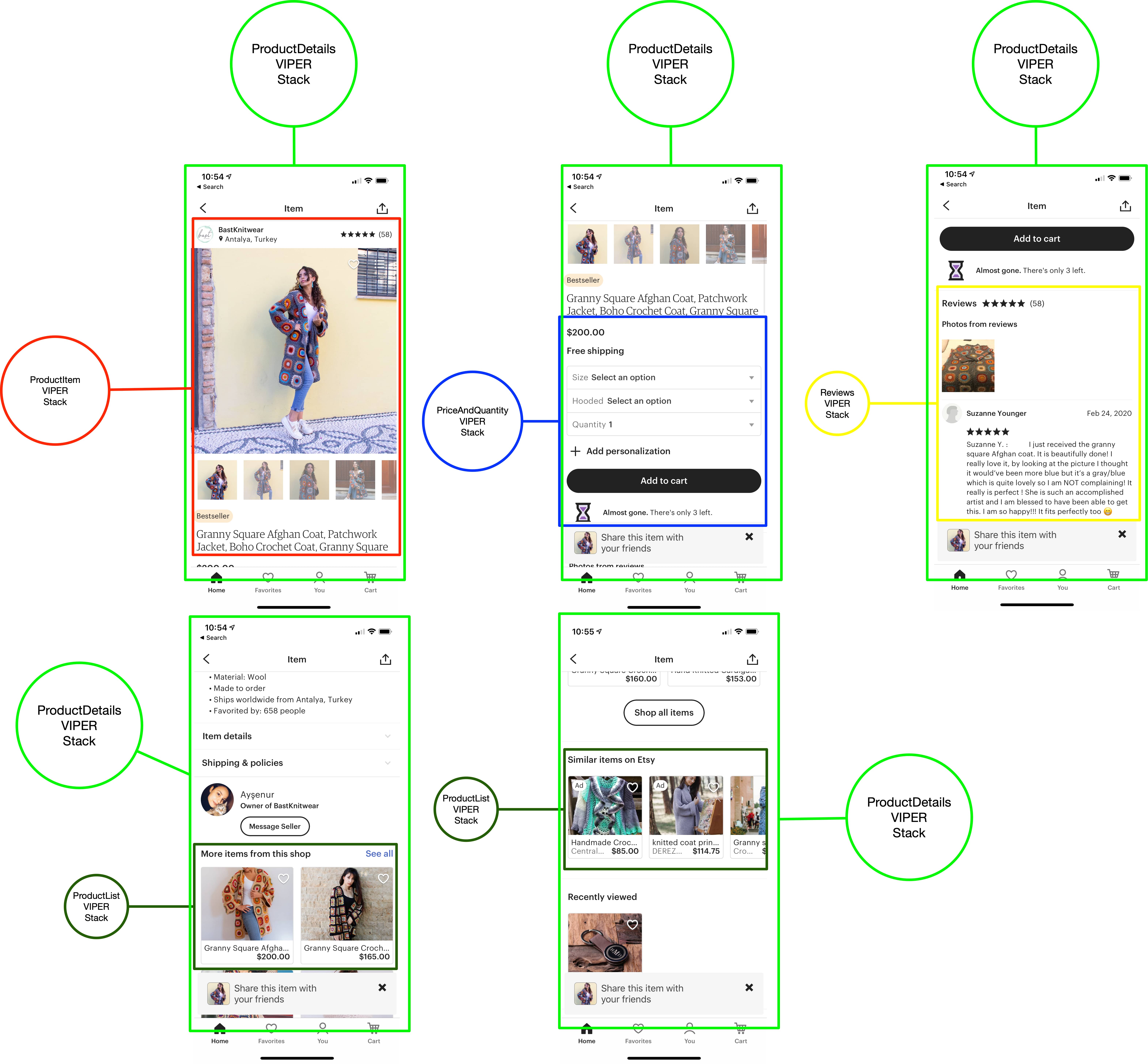
Product Details Structure
Overall structure of this screen will be similar to the Home screen where there will be a container view that holds a collection of children views that can be arranged in any order desired.
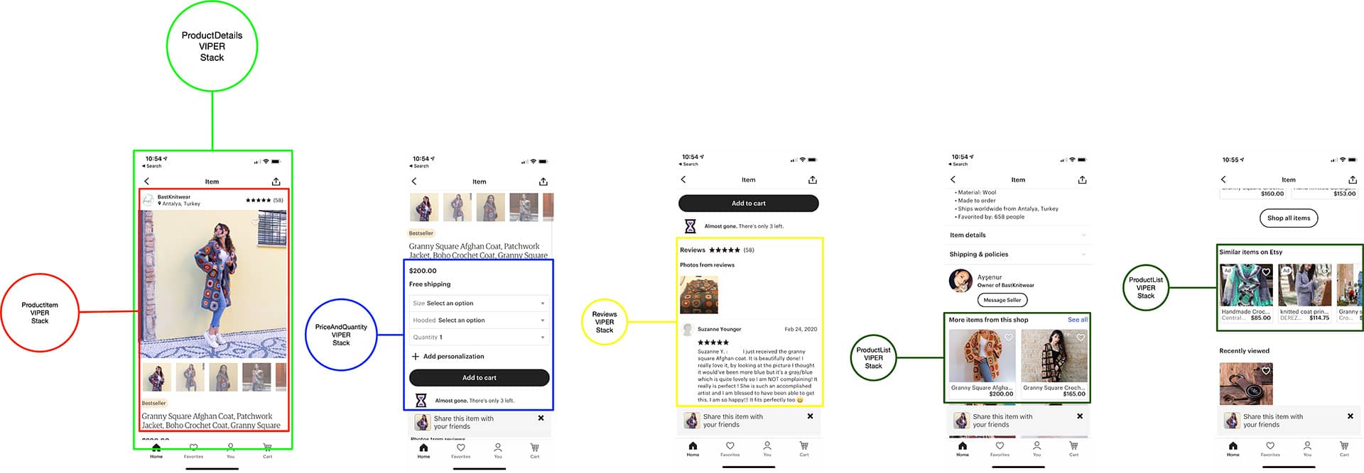
ProductDetails VIPER stack is a container stack that orchestrates what needs to be added to its list of children (ProductItem first, then PriceAndQuantity, etc.) and responds and coordinates all the routing from them (e.g. when the star button is tapped in ProductItem, it will route to Reviews VIPER stack).
Product Details Dependencies & Architecture
Just like with other parts of the app, each VIPER stack will have its own set of dependencies. Just like with Home Screen, we’ll go for a split data fetching approach where each component/VIPER stack fetches its own data, but you can go another route and have the container fetch everything in one bulk request and then tell children VIPER stacks to render data.
Dependencies for each VC look like this:
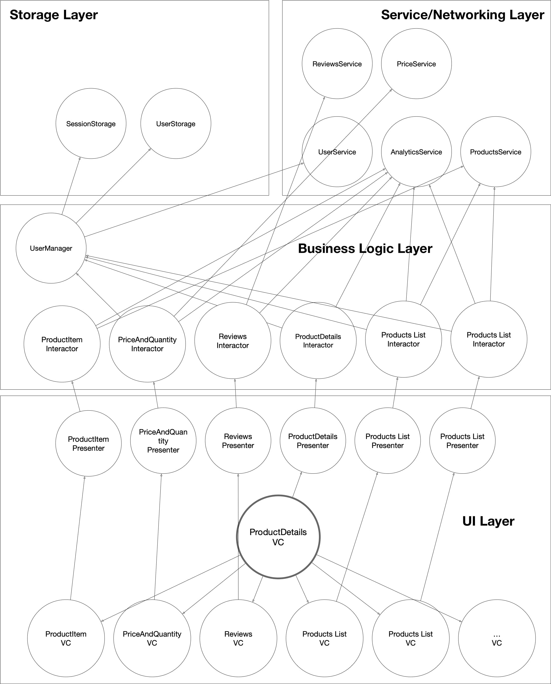
This is a very crowded diagram, but it encompasses the overall structure and architecture of this screen.
Let’s take a look at each VIPER stack in detail:
ProductDetails VIPER Stack
ProductDetailsVC acts as a container for any child VCs, such as ProductItem, PriceAndQuantity, etc., placed in it. It depends on ProductDetailsInteractor for business logic.
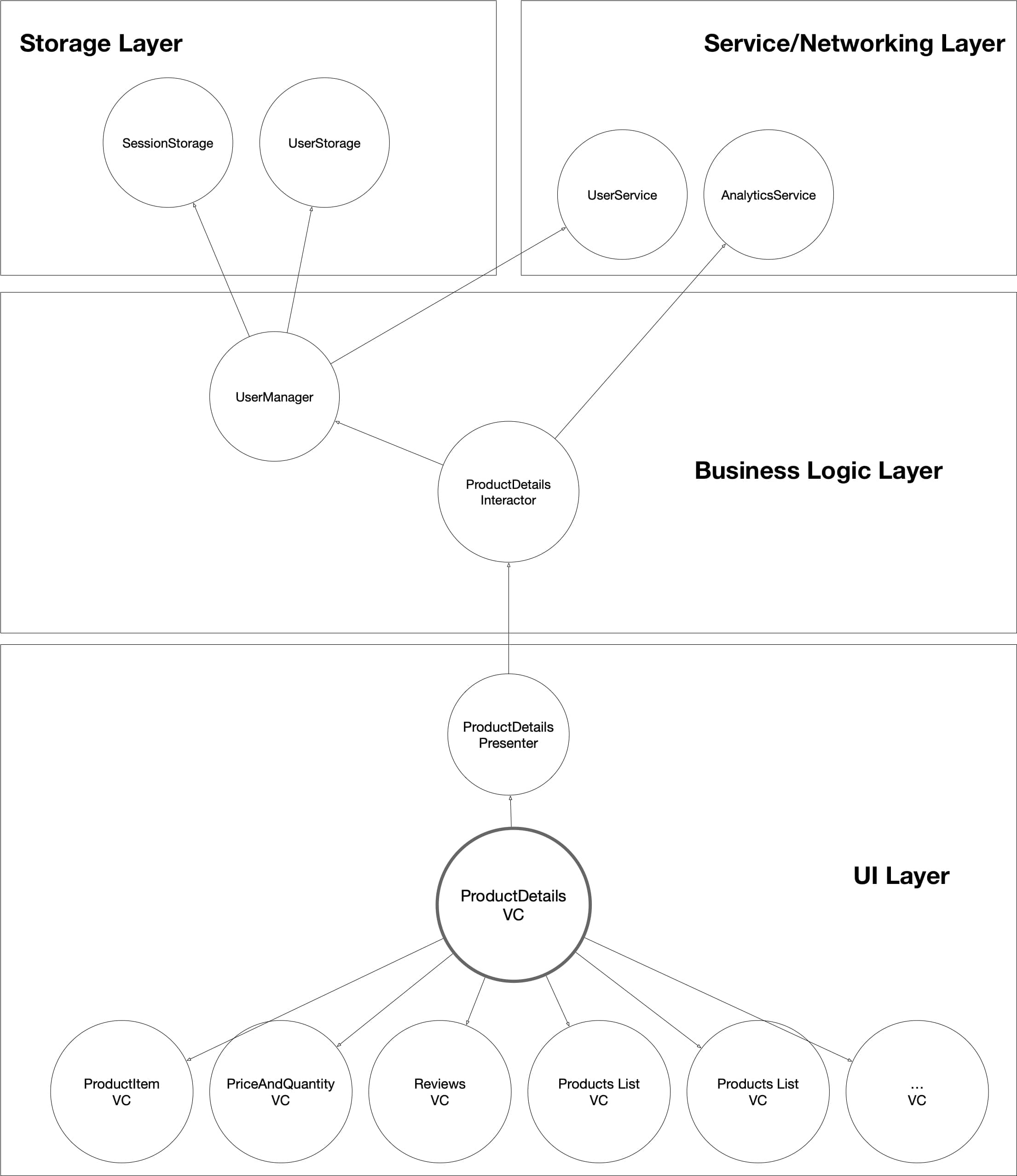
ProductDetailsInteractor depends on AnalyticsService and UserManager. It uses AnalyticsService to track when the screen was presented. It uses UserManager to get user ID and other necessary data for analytics and passes it down to children VIPER stacks as their dependency.
ProductItem VIPER Stack
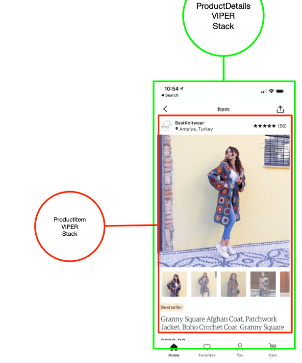
ProductItemVC displays particular details about the selected product, such as store name, icon, location, number of reviews, product images carousel, product tags, product title/description, etc.
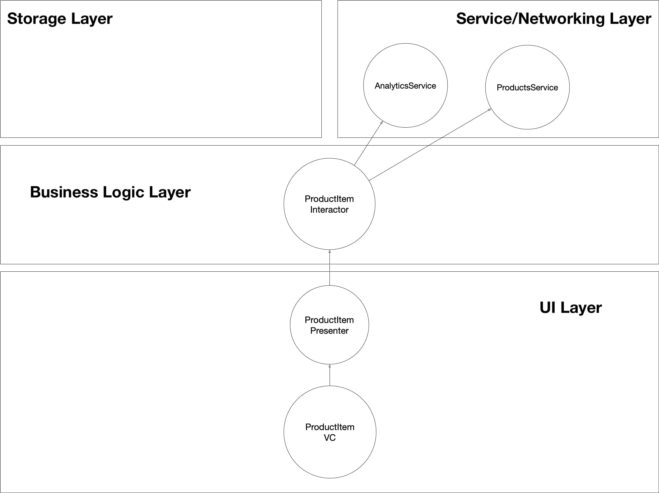
ProductItemIneractor holds business logic for fetching data and coordinating its display on screen. It depends on AnalyticsService to track data about user interactions, such as swiping to slide between carousel pictures and taps on review stars and store names. It uses ProductsService to fetch product data to be displayed.
PriceAndQuantity VIPER Stack
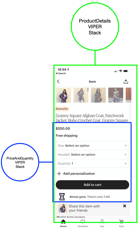
PriceAndQuantityVC displays price and/or discounts applied to the selected product. It shows shipping info and type/variation and quantity of item selected.
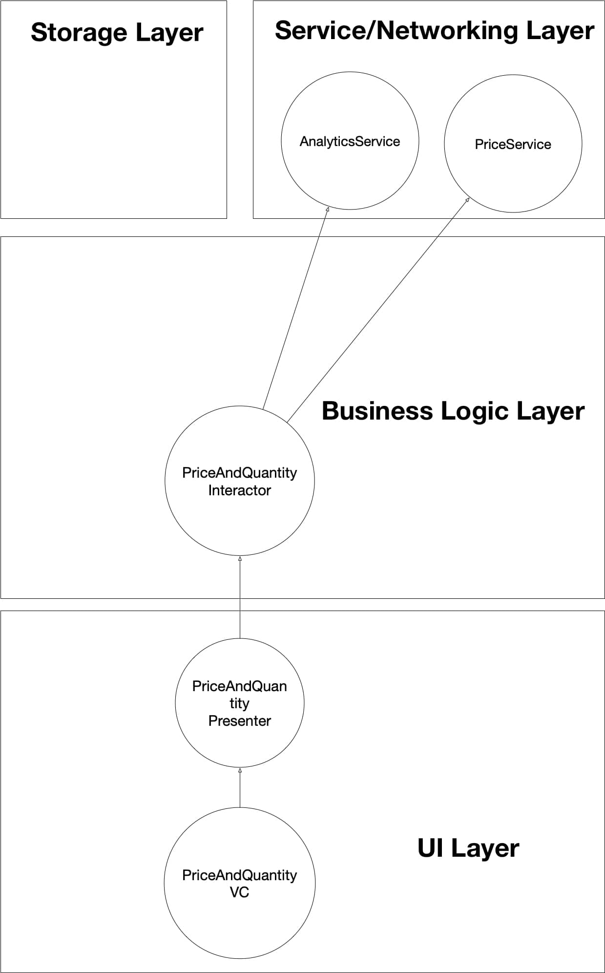
PriceAndQuantityInteractor coordinates fetching data to display price for selected price/quantity/discount combination. It uses PriceService to fetch the data and AnalyticsService to track user taps and quantity/variation selection.
Reviews VIPER Stack
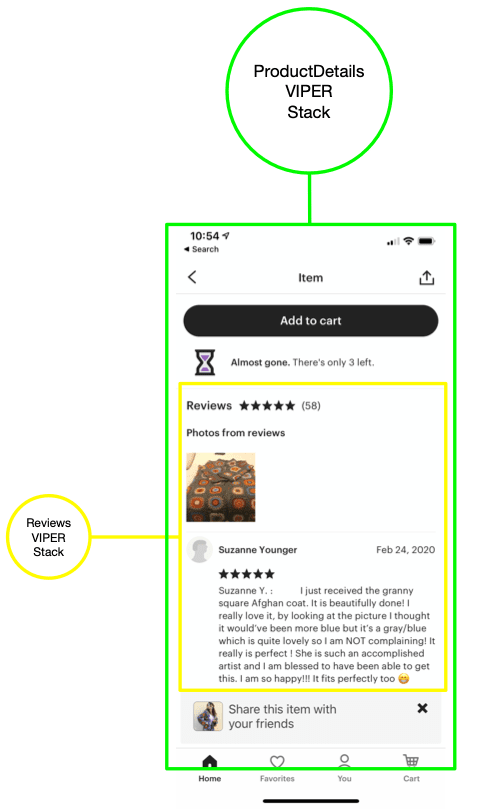
ReviewsVC a list of recent reviews, total number of reviews, and overall rating of the selected item.
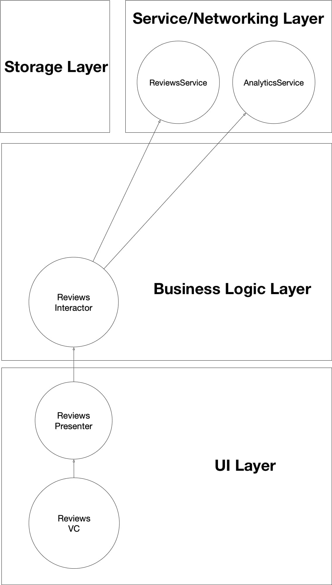
ReviewsInteractor coordinates fetching and displaying recent reviews for the selected item. It uses ReviewsService to fetch data and AnalyticsService to track when reviews were tapped on.
ProductList VIPER Stack
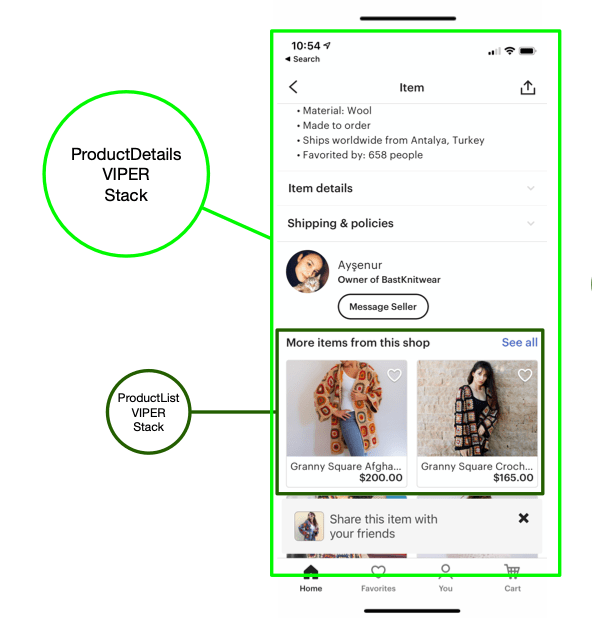
Here we want to display more items from the same seller, which is essentially the same product list as in Home Screen. We’ll be reusing ProductList VIPER stack and giving it a configuration to fetch only a subset of items from the store. All of its dependencies are the same (see it in the Home Tab section above).
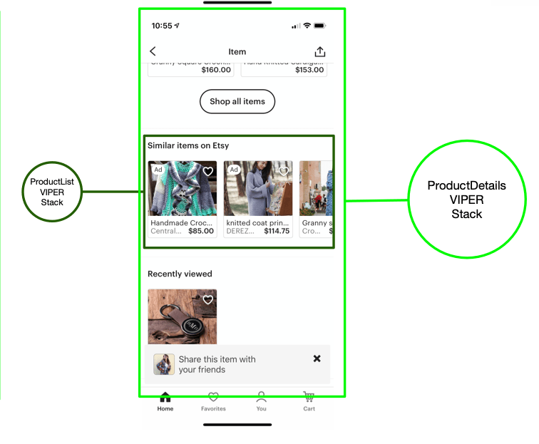
We also will be reusing ProductList VIPER stack in similar fashion to display similar items list.
Data Flow in Product Details
Just like in Home screen, Product Details screen delegates data flow handling to its children VIPER stacks. When the Product Details screen is displayed, it attaches children VIPER stacks (ProductItem, PriceAndQuantity, Reviews, etc.) so that they handle each piece of this complex screen. These VIPER stacks then execute their own respective logic of fetching and displaying data and handle most of the user interaction.
Here is an example of data flow in Reviews VIPER stack that was attached to Product Details as a child:
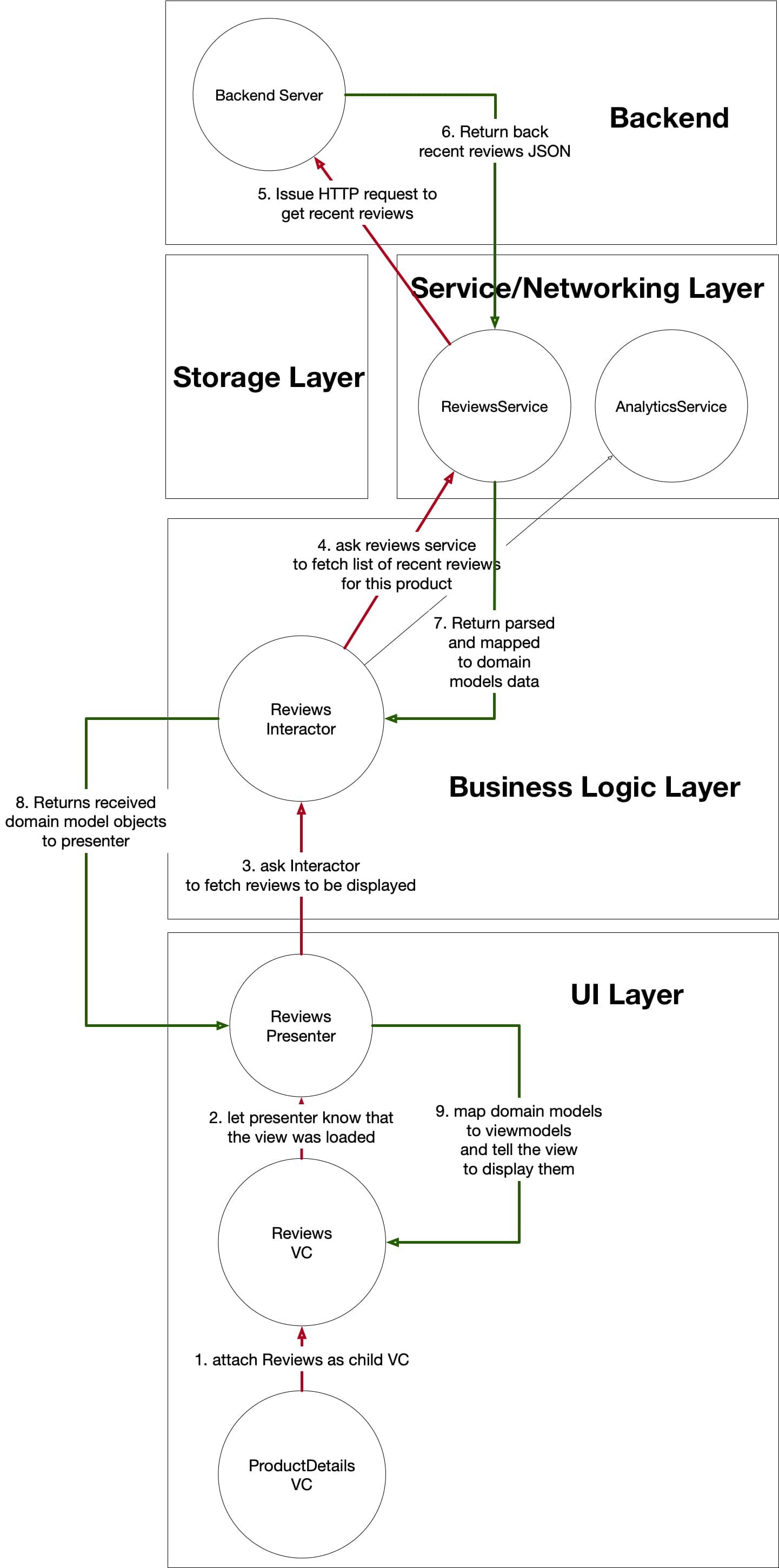
- When ProductDetailsVC attaches Reviews as its child view controller, Reviews VIPER stack’s life cycle begins.
- ReviewsVC lets presenter know that a user interaction happened. In this case the “user interaction“ is just the fact that the view loaded on the screen (it was still because of the user action previously so it’s still considered a user action)
- ReviewsPresenter asks ReviewsInteractor to fetch reviews to be displayed.
- ReviewsInteractor uses its dependency, ReviewsService, to fetch recent reviews from the backend.
- ReviewsService makes an HTTP GET request to fetch recent reviews data.
- ReviewsService receives back a response from the backend with a JSON representation of recent reviews for the selected product.
- ReviewsService maps the JSON it got to domain models and returns the result back to ReviewsInteractor.
- ReviewsInteractor passes received domain models to presenter.
- ReviewsPresenter maps received domain models to view models and tells the view to render them.
Data flows in a similar fashion in the other children VIPER stacks of Product Details screen. Each is individually responsible for their respective scope of this screen.
A/B Testing & Feature Flagging
A/B Testing sometimes is a question in system design interviews — large organizations with a lot of users definitely want to run several variations of a particular feature. Usually users are split into two groups as the new feature is introduced — group A are the users who have the feature enabled, and group B is the control group with the feature disabled (i.e. previous, pre-feature release functionality).
Feature flagging is a best practice when delivering software, especially on a large scale. The idea is that you can roll out a feature only to a group of users and monitor performance — if it’s satisfactory, then you roll it out to everyone. If something dramatic happens, like the crash rate going up, then the feature that causes it can be disabled by disabling the feature flag for it.
From the system design perspective, you can achieve both by injecting ABTestingService object into any one of the interactors where you need to A/B test or enable/disable features based on feature flags. ABTestingService, in turn, will fetch and cache latest A/B testing groups and feature flags from the backend. Interactors (or other objects in the app) will then check with ABTestingService every time they try to present a feature behind a feature flag to the user.
The downside of this system is that your app has to rely on connectivity with the backend to get the latest feature flags or A/B testing flags. Sometimes requests for it might fail, or the user might be offline for a prolonged period of time. Also, another problem is mitigating the fact that your app might not function “properly” upon application launch because not all of the feature flags (or not the latest set) were received from the backend yet. To address that, you can either let the user wait and freeze the launch screen until all the flags are received or let the user continue using the app and fetch them in the background. In the former case, the user might perceive the app to be slow to launch; in the latter, the user will have the latest flags/functionality only after subsequent launches of the app (i.e. they run the app first, get the flags, and then after the next quit/launch of the app, they’ll get the latest functionality). Neither approach is better or worse, and in my opinion, making the user wait is better, but I see the trend for apps to skew towards fetching flags in the background so as to not to make an impression that the app is slow to launch.
Conclusion
In this article, we’ve covered two most commonly focused-on screens, Home and Product, in a system design interview for an e-commerce application. VIPER is one of the architectural options you can choose for this. It’s a good choice because it’s scalable and modular and can support a large team, but you can also use other architectures and design patterns for this, such as MVVM and Coordinator.
Btw, this article is an excerpt chapter from iOS System Design Interview Course that I'm working on. Check it out if you're looking to prepare for iOS system design interviews. It has chapters like this one and videos covering system design of various iOS apps such as: Social Media (Instagram), E-commerce (Etsy), Messenger (Facebook Messenger), and more.
Other Interview Prep Articles
Here are some other articles you might find useful if you're currently prepping for an iOS inteview.